7.Semester Neptune
In Terms of astrology and zodiac sign the end is also the beginning of me. Neptune is the most influential planet for pisces and also represents in the zodiac as well as the solar System the end . The last semester was all About combining everything i learned into writing my Bachelor Thesis, but like everything in my life when it really Counts something bad happens or i misunderstood the Task. Funny Thing the last month of writing my Bachelor Thesis my Laptop did not work properly because some letters did not function so i had to copy them.Well, Maybe you think why should i hire you if you Always make the wrong decisions or bad luck follows you like ,excuse my language, sh... with flies.but i think honesty is one of the most important values in life---honesty About your life,your character and People around.you.The only positive Thing that you can can conclude of having this Kind of life is that when you went through almost all negative Outcomes in life you have the knowledge where you can predict Outcomes and what not to do and that is often times more valuable than to know what to do. Bad luck is for me the missing Knowledge of something...
Visual Design, Design Thinking, Billboard Design, Styleguide, Marketing
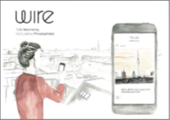
Wire

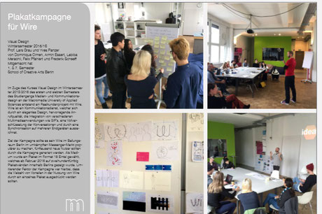
In the winter semester 2015/2016 at the Macromedia School of Applied Sciences, we were entrusted with the task of creating an advertising poster design for the instant messaging service Wire in
cooperation with the outdoor advertising service provider Stroer. A poster in the format of 18 : 1 was to be created, which will be shown on 250 billboards in Berlin for two weeks from February
2016.
This project was a cross-semester project between the seventh and first semesters of media and communication design. Within the project, a strict division of tasks prevailed at the beginning,
which was broken later on and the tasks were flowing.
The first semester was entrusted with creating the first pure visual designs. In the seventh semester, we were entrusted with the students of the first semester to look after them in many ways.
We were transferred to the fictional postion of an art director team. This was our task to provide strategic, planning and design assistance and, first of all, input. We were also in the position
of a contact person for the study beginners at all times in order to provide them with advice and assistance. After completing the poster design, we wanted to create a method of documentation
that allows all stakeholders the possibility of a simple presentation.
This should ensure that students and the university have a figurehead for themselves and that the customer may have another opportunity to present their own fresh products. In the course of this documentation, the requirements for the project, the approach to the project, the didactics of the design and the elaboration of a visual documentation concept that is suitable for presentation will be described.
It was illustrated that posters must be designed in such a way that they can be perceived and recorded by passers-by in 0.7 seconds. Accordingly, we were advised to use a maximum of five wiring elements in the design to guarantee easy to grasp. Incisive elements should be placed in a sharp and easily grasped manner.
In addition, the sender of the message must be highlighted by a well-sized speech placement and a product image. In the design, it is essential that strong contrasts and color effects are used to visually direct the addressees and to direct the view to the claims. It is important to use condensed and concise information. A very limited number of words was proposed, five words were proposed
Example Picture given by Stroer
by Stroers on the part of Stroers, which are presented in a suitable headline form and are designed appropriately. In general, the premise is to use emotionalized images and messages, because the viewer can be so well bound and the advertising messages can be transported in an understandable way quickly and easily. Above all, it is about creating a positive mood towards the advertised product.
Above all, it is about creating a positive mood towards the advertised product. In doing so, the possibility of faces being used, as they convey a special effect in terms of emotions and attention in terms of perceptual psychology. As a choice in the design, it was suggested to us to refer the environment of the advertising poster to the product, as this can achieve a suitable effect and an enhanced effect of the poster.
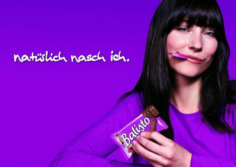
After the Stroer presentation we received a customer briefing from Wire by the Head of Marketing Siim Teller.
During the presentation, Siim presented the product Wire and peeled out the goals of the campaign. Wire is a multifunctional instant messaging Service.
Briefing
The functions email, SMS, calls and file sharing were combined in a dozen-like app that runs across platforms, across platforms, on desktops, tablets and smartphones. All common operating systems are operated. Siim also pointed out that Wire is different from the competition due to some key factors. Above all, the design impresses with its elegance and simplicity. Wire also offers outstanding clear call quality and seamless end-to-end full encryption, making it secure and offering superior privacy. Conversations are undernourished by a visually rich appearance. It is possible to embed pictures, videos, music from Soundlcloud and Spotify, GIFs and sketches in the conversations.
The target group is young dynamic people in urban areas who have a strong sense of designto place an increased emphasis on one's own privacy and want to use a high-quality and fun messenger. What is important is that Wire is aimed at end users, not companies. All EU privacy directives are respected.Strong market penetration is present in some conurbations. In the U.S., New York City and California environments with amplifier activity are active. London, India, China and the Middle East were also mentioned. The specific task of the campaign should be to expand the number of users in Berlin by five thousand more users. Accordingly, a local connection to Berlin should be established in the design of posters.
Preparing the design process
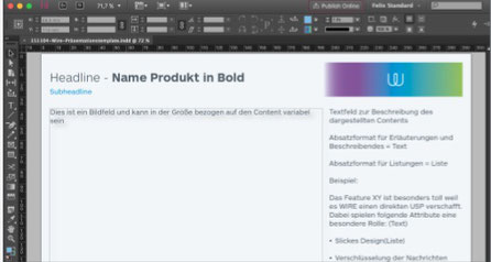
Since we had to create and hold many internal and external presentations during the course of the project, we first created a presentation template in InDesign to have a consistent platform for
presenting our work results. The colors and fonts of Wire were used to get a suitable layout. On request, we received work data from Siim, which led us to create a style guide that should be used
for poster design.
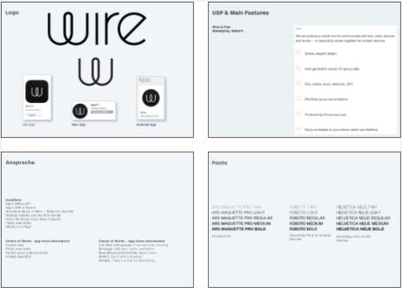
Here the logo was recorded in the different variants and the main features were again listed. The customer approach was analyzed in order to be able to adapt the wording to the wire procedure in
later steps. Complementary to the use of the fonts were requested and incorporated.
The Ars Marquette Pro is used as a primary font in the commercial context. The robot serves as secondary font on Android devices and the Helvetica New on iOS devices. • has been summarized here,
summarized on the relevant platforms
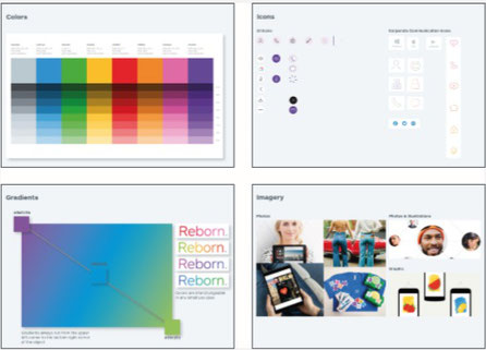
Our aim was to understand the visual characteristics of the respective screens, so that we could consciously understand the in-fact
In order to be able to design efficiently, the colors were recorded and created as an exchange color palette with all gradations in InDesign. The way the gradients work and how fonts are used has
also been included.
The appearance of the Icon World has also been captured and categorized. Since we were to create a poster, it was essential for us to understand and explain the use and effect of images. In
addition, the target group was defined and written down in keywords
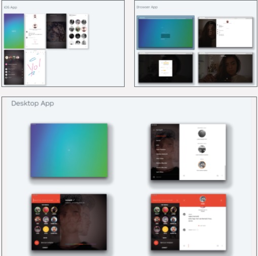
The appearance of the app has been summarized here, on the relevant platforms. Our aim was to understand the visual features of the respective screens, so that we can consciously integrate the interface into the poster design.
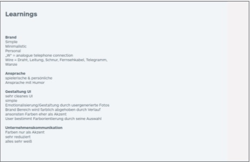
In summary, the learnings from style analysis at the end of the style guide were summarized as a guideline. The focus was on the meaning sections brand, approach, design & UI as well as corporate communication. After the analysis of Wire was completed, a competitor analysis was carried out to understand the customer approach, the visual appearance and the USP's. For this purpose, the ten strongest competitors worldwide were analyzed.
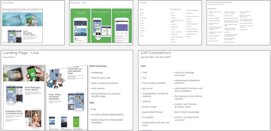
The landing pages were recorded here together with the main functions and the USP's to get an overview. The viewport of the respective homepages has been recorded because we were thus able to
grasp the direct approach. We also recorded the mobile screens in order to be able to evaluate the resulting designs and speeches.
The findings were summarized in relation to the most important sub-areas Wording, Features and USP's. As a result, it was possible to recognize the advantages of Wire and integrate them into the
design in a targeted way
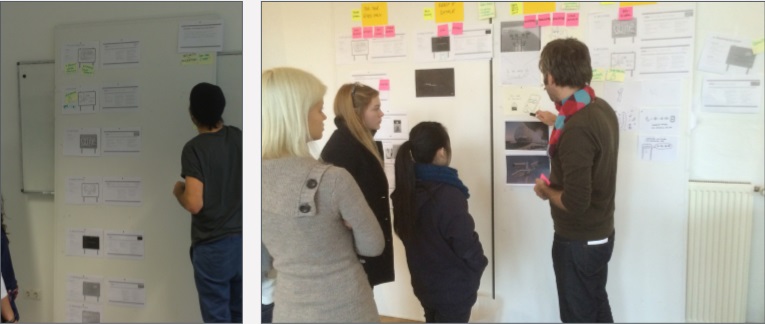
First drafts and workshop
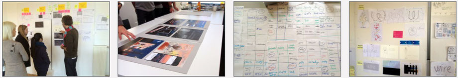
During the planning and recording phase of the seventh semester, the first drafts were created by the first semester. Many different ideas arose and were later partially adopted and further
processed. Subsequently, a workshop was carried out in order to be able to create designs adapted to Wire. It was especially important for the working group that it was defined which parts of
communication and a messenger are particularly important for us and that they can be used emotionally.
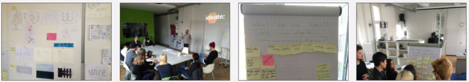
Before that, we meticulously planned the course of the workshop and tried to define the relevant questions, this process of preliminary planning was carried out by the lecturers and the students
of the seventh semester. After the beginning, everyone got an introduction to the process of the project and there was a team building game. The group was divided as diversely as possible by age,
gender, cultural background and other parameters.
The questions "What do we like about digital communication" and "What do we ton't like about digital Communication" were asked and collected separately in two teams.
The user needs were queried by the question "How might we define the main user need in modern communication" and discussed in both teams. In a grad game, the most important aspects were collected
and written down by everyone.
The subjectively most important requirements were shown by each and the main categories to be used resulted, which were visually taken up in later sketches.
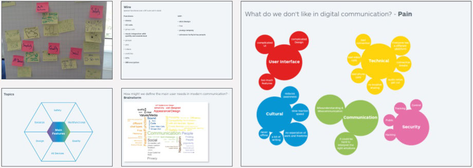
Simplicity, Quality, Safety, Privacy, Social and Multifeatures stood out and were presented in a short ideation phase. From here on, it was the task of the first semester to design posters from
the conclusions in the respective categories. The seventh semester was devoted to documenting the workshop and preserving the insights. The Main User Needs and the relevant functions were
subsequently favored.
Pain and Gain were combined to define directions in the design. Subsequently, the main features were worked out and forwarded separately, so that several suitable designs could be worked out on
the topic.
Creation of drafts and pitches
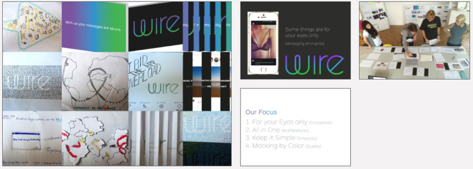
It was now the task of the first semester to create posters for the topics Encryption, Multifeatures, Simplicity and Quality. A variety of variants and a presentation have been created. The drafts were discussed in the group.
The best ones have been highlighted and should now be revised to have presentation-ready content that should soon be presented in a first pitch at Wire. Armin has reworked the designs and put them in a drawn style.
The didactics and design of the presentation were then corrected under the guidance of Yves Panzer and the seventh semesters. For all four areas defined in the workshop, this was covered. A
presentation style of the designs on a poster mockup was considered. The presenters have been defined. The concepts are now presented.
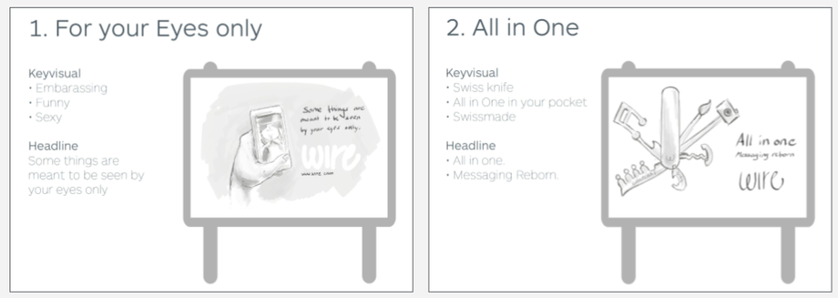
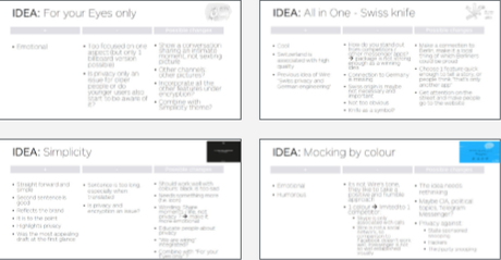
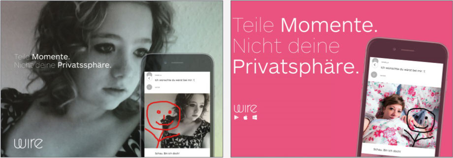
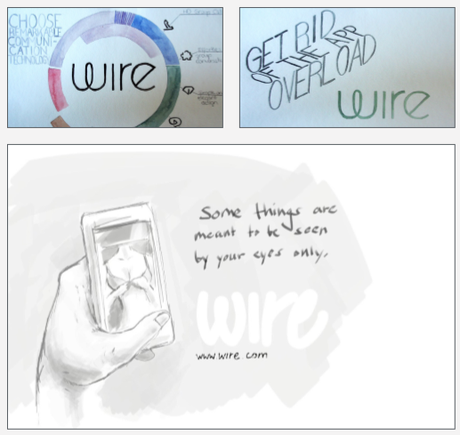
his draft addresses the over-the-top encryption issue. One sees a hand holding a smartphone on the screen is seen in the wire interface an erotic image of a lady in underwear. As a claim, "Some
things are meant to be seen by your eyes only." The topic of encryption is used to position Wire against measurements like Whats App prominently and securely through the sexting process, because
Wire is safe, no data is leaked and you can send delicate pictures as a user.
Here, the mulit functionality of Wire is symbolized by a pocket knife. Each function corresponds to a folded-out tool. The claim is "All in One. Messaging Reborn." Another reference to Wire is
created by using a Swiss army knife, as Wire is a Swiss company. In a second design, a Wordcloud is used, which represents the many advantages of Wire and produces the Wire logo in the
negative.
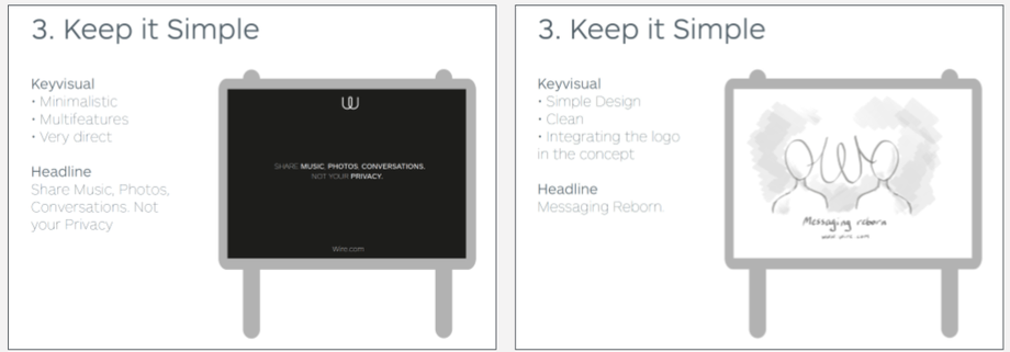
In these two designs, the theme of Simplicity is used to represent the simple and chic design of the Wire Messenger. The drafts are minimalistic, directly in the speech. Furthermore, the logo is playfully integrated into the design in a rifle phone.
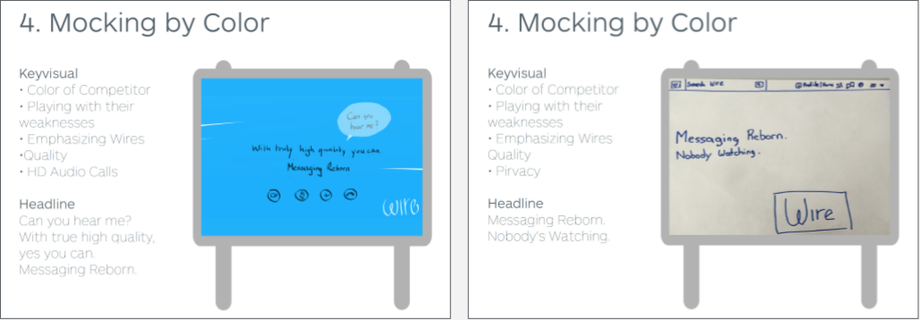
Here the colours of the competition are played. The blue refers to Skype and the question about the call quality and the question "Can you hear me?" as the intial question of a Skype call. This
leads to the claim "With true high quality, yes you can. Messaging reborn.". The advantage of Wire is put in the foreground and the competition is ridiculed. In the second draft, the interface of
the competitor Facebook is displayed and alluded to the lack of privacy.
The results of the strategy for Wire and the drafts were presented and then discussed in a feedback round. The first semester then produced a summary of the feedback for each design.
Positive aspects, negative aspects and possible changes were collected and clearly visualized. In the next steps, the feedback was used in the course of the interation process to improve existing
ones and to develop new composite ideas. Now a brief summary of the feedback is to be given in order to be able to follow the decisions on the respective drafts.
1. For your eyes Only
It was considered positive that it is a very emotional poster. Negative aspects were that only one aspect of Wire (privacy) was taken up. It also found that the issue of privacy was addressed to
older people rather than younger ones. As a suggestion for improvement, it was mentioned that an intimate moment should be shown, not sexting. Other images should be used. Would it be possible to
use other features under the topic Encryption too.
2. All in One - Swiss Knife
In general, the connection between Swiss product quality and wire was well received, the design even followed a claim developed by your "Swiss privacy and German engineering". The main negative
was that most other messengers have the same functions and you can't position yourself sufficiently in a demarcated position. In addition, there is no connection to Germany and it is not too
obvious that this is a messenger. In addition, the Swiss origin does not seem important enough to them, as an increase in users is defined as a campaign goal, especially in Berlin. Proposals
for changes were aimed at creating a link to Berlin, generating attention on the street that would let people go to the website.
3. All in One - Word Bank
The idea of a social aspect was praised, a combined image would be possible. The value of this design is seen by the good effect from a distance and arouses an interest in what it is explicitly
by designing. It was criticized that the idea is not completely new and that it would be difficult to find out in the current design what it is. Opportunities for optimization would be hidden
sentences of conversations, not just individual words in Word Bank with single words highlighted.
4. Simplicity
The idea was seen as simple and simple, in general the brand is presented, but the claim was too land, especially as soon as it was translated into German. As an improvement proposal, it has been said that a different colour should be used, as black seems very sad.
5. Rifle phone:The idea was already well known and received favourably. However, it has been questioned that the viewers recognize what exactly it is. This campaign would work the brand would
already be better known. In addition, wire.com is more important than the wire logo alone.
6.Mocking by Colour & Interface
The emotionality and humour was praised. Despite all this, it is not the tonality of Wire to make fun of others. In addition, the color choice refers only to one competitor. In this example, only
Skype is counteracted. Skype only offers calls, so Wire's range of features isn't covered. The comparison with Facebook is also lagging, as Wire is not a social network. The idea should be
reconsidered in general. Possible scenarios such as the CIA, NSA and politics were mentioned to contrast privacy with handsome surveillance, hackers and other snoopers.
Discussion of the Results
All feedback was critically captured and new drafts were created in relation to the feedback received. In addition, the language choice was discussed on the poster. German should now be used, as the proportion of foreign-language tourists in Berlin is subject to the number of German-speaking tourists.
The approaches of the new drafts were discussed and then it was agreed to work out some by the next date in small teams. Apparently, a presentation was created again, which was presented to
Wire.
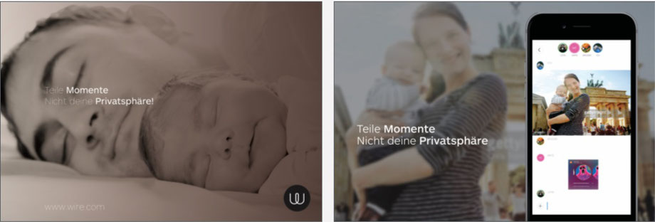
This draft represents a further development of the previous sexting design. An intimate moment in the parent-child relationship was presented. This draft was taken on board in a positive light by the basic idea. However, it was not clear that it was an advertisement for an app. Thus, the principle was transferred to a representation with an interface. The second design was well received, but was intended to appeal to a younger audience, which is why the motif was swapped.
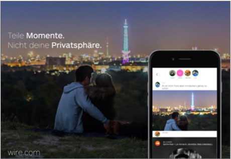
This design should be shown in the second presentation at Wire. Soft colours and a young couple with the Berlin House Sea and the Alex looked more dynamic than a mother with a child in front of
the Brandenburg Gate.
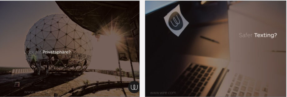
These two drafts are dedicated to the topic of privacy. The design with the dome shows the Teufelsberg. A former US interception station in Berlin during the Cold War. This was intended to show the freedom to eavesdrop, this draft was discarded because again the reference to the app was not given.
In the design with the laptop, the practice of camera sticking was discussed. A wire sticker was used to show the security of the app. For this purpose, the claim "Safer Texting" was used to
further underline the effect. This design was also rated as too abstract for the viewer. In general, the designs were considered too dytopic and sinister.
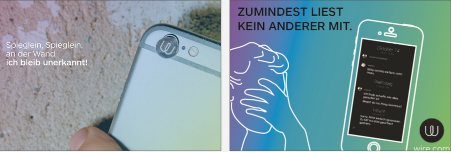
In this design, a mobile phone was used, as it is primarily an app. The wire gradient was subtly placed over the image and seasoned with a touch of humour along with the claim "Mirror, Mirror on the wall, I remain unrecognized."
This design was intended to handle messengers in a humorous way. It's an embarrassing chat history, the positive logical consequence that can be drawn is that no one else can read along.
Here, spying through the keyhole is symbolized to a communication app. Through the keyhole, an eye looks at what is covered by the claim "with wire you are safe", thus putting Wire in the focus of security.
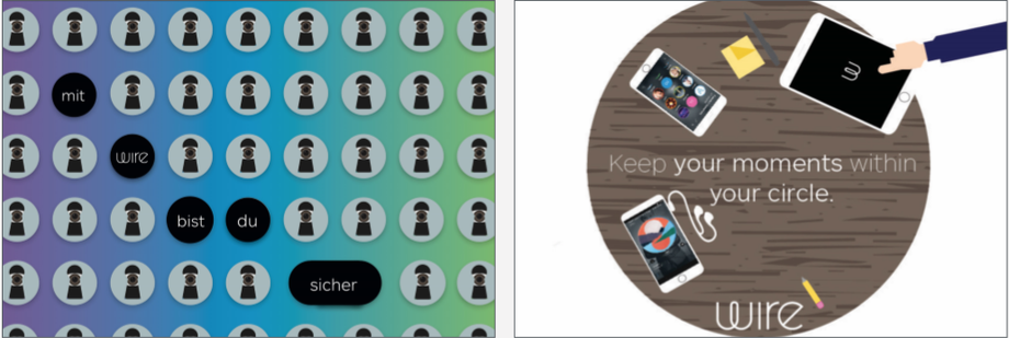
In this draft, the topic of multifeatures was taken up and associated with the moment of privacy. Various features of the app are displayed on a variety of devices and are located on a table. The
cohesiveness and safety of the system are thus mapped.
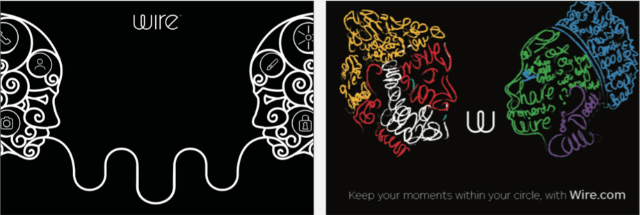
The subject of Simplicity has been taken up here. Two faces are shown in the profile. Once, the heads are ornamented, and the features are represented by symbols. The two sides connect by a
strand and shapes the wire W in the middle.
The second variant creates the heads by text messages in different colors. In the middle, the Wire logo is again located.
Second Pitch
Afterwards, another presentation was given at Wire with these designs. Feedback has been received again, which has been reworked in another iteration level.
In summary, the two strongest ideas are still "For Your Eyes Only" and "Simplicity". However, it was noted that the designs from the second phase were all too crowded and did not do justice to
the 0.7 seconds of poster perception.
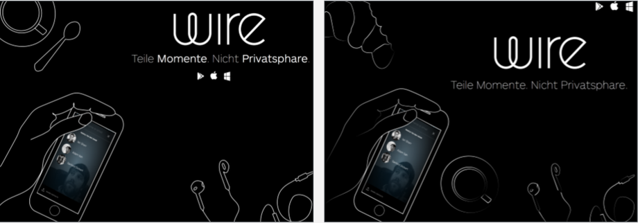
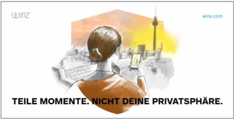
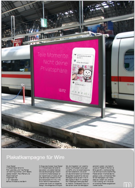
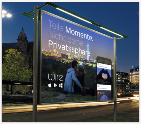
Our claim "Share moments, not your privacy has been well received. It was stated that the black wire interface is a unique selling point and that one should try out both variants in the designs.
By January 14, 2016, the Selected Versions should be revised and straight drawn so that a final
could be made. The feedback on the individual topics will now be summarised.
Initmacy and Privacy was generally accepted as a good idea. However, it was the wire today too colorful us did not reflect the colors of the Berlin towers. In addition, the poster campaign was
scheduled for February, which is why a summer picture was viewed critically.
Security variants with laptop and mobile phone were smashed because they seemed too paranoid. The sticker looked old and used, so it didn't fit the modern slick design of the app. It has been
rated too difficult to detect a connection between security, app and features. It was noted that this image would be well suited for a social media campaign. The
the same problem was detected in the keyhole variant. It was not clear from the current design whether Wire is part of the spying eye or not. Moreover, it was not clear from this design what wire
is exactly.
All In One coupled with Simplicity was generally positive. However, the draft was harshly criticized because the style was not taken by Wire. The integration of notepads and pens was also seen as
negative, as it suggests work and Wire is more aimed at private individuals.
The Simplicity design with the two silhouettes that connect in the middle to the Wire logo was positively received. However, the design had to be adapted because the design was too reminiscent of
robots and the design was too aggressive and removed from the
Brand Style. The second colorful Simplicity design was well received, but again the desired style was not found. Thus, a new draft series was prepared in which the feedback on the drafts was
adjusted. The first sketches were made according to the topics requested by the customer and visually worked out in the following, so that footage for the finale presentation was available at
Wire.
This design alludes to privacy and adds features of Wire in the app's interface. The girlfriend of a user is sad that he can not be with her. The friend gets a picture of her on which she is sad,
he uses the sketch feature and paints himself as a stick figure in the picture with the statement that he is there. This suggests an intimate proximity, which is possible through wire.
Here you can see a modified version of the selfie version. The background color is taken from the Wire color palette and an attempt was made to tell the emotional picture story in a picture. This
means that the short attention span of the poster viewers can be optimally filled.
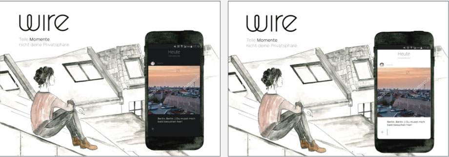
Here, the sketched style of the liked first sexting design was revisited and defused to a Berlin scene above the roofs of the city. The phone is also drawn only the interface is digital and
original. This depicts a typical Berlin scene in a mix of styles and creates a character of casualness. The designs were reworked at that time to create a professional look.
Refinement of the designs
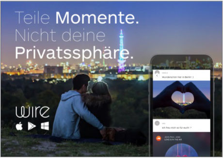
In the previous version, there was a logic error. The couple sent the picture of their backs to friends. In this design you can see how the couple's hands form a heart that encompassed the night
sky of Berlin. The Soundcloud track has been changed to "Love is in the Air".
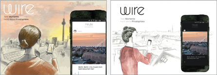
Here the drawn designs were refined. In addition, a completely drawn variant was tried out. Another perspective was included in the design.
Here you can see variants of the Simplicity design. It was about creating a new composition of the image with new details like the croissant.
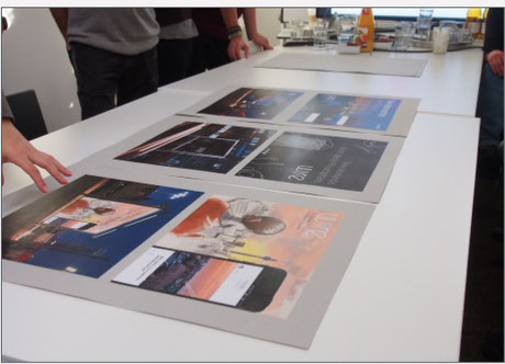
Final Pitch
After all the drafts were discussed, the students created a didactic finale presentation for Wire. It should be ensured that Wire buys one of the designs. For this purpose, the designs were
inserted into mockups to guarantee a spectacular representation of the designs in a real environment. For the pitch, the Wire Office re-checked before the appointment, and Yves added recent
changes and annotations. The designs were then assembled and mounted on presentation boards. On the way to Wire, the tasks were distributed.
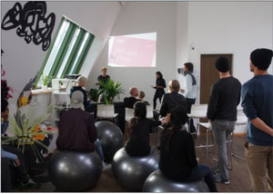
The team agreed that Patrick would give an introduction to the presentation, after which individuals would introduce the slides. We were received warmly and after the usual coffee and small talk
the presentation began. The designs were presented one by one by the responsible students. Our lecturers Lars Grau, Yves Panzer and Thomas Stegmann completed the presentation with professional
additional arguments.
After our presentations, a shortlist was made and discussed. Detailed feedback has been received on these drafts. All drafts require some night work. Due to the late final date at Wire, the drafts are finally presented here, which were accepted. The incorporation of the requests for changes can only be documented to a limited extent at this point, since it is at this time a few days before the submission of the university project. Accordingly, the final processing of the selected poster will take place after the submission of this project documentation. Here is the last selection. After the pure creative process of the Wire project had been completed, we asked ourselves how we would build the project based on various channels can be targeted.
The aim is to develop the most exciting and sensational representation possible in various forms in order to be able to be used in a variance of scenarios. On the right side you can see an
interim solution, which was created by Wire. A mixture of both drawn image styles was created on the design. In addition, the drawing is encased in the silhouette of a sign. The sign was
developed by Wire and will be used in the corporate identity in the future. In further steps, this design will be worked out either by Wire's in-house visual designers or by the seventh semester
students. It is not clear who will take on this task at this stage.
Then, the visual and reusable documentation process of this work will be described in the next section.
Documentation
Since it was a visual project, the aim of the seventh semester was to develop a documentation that was as pictorial as possible coupled with small descriptive texts. Text lengths and the fullness
of images varied in the chosen former, which were to serve different purposes.
The aim was to be able to play as many different channels as possible. Our task was to develop a holistic design and presentation concept. This should ensure that targeted documentation is made
possible for customers, the university and students in portfolios. After reflection, we agreed on the formats A0 Poster Hochkant, A3 Doppelseite Quer, a slideshow and web-optimized account. Here
the elaborated formats are to be described and presented.
A0 Uniposter
The aim of this format in the format catalogue is to be able to present the finale effective effect poster attention in the university. The poster is displayed alone with a short description in
keywords. The project name, the participating courses of study, the year of manufacture and the customer are mentioned.
A3 Cross Double Side
The A3 double page fulfils the function of a print portfolio format, which is about creating a suitable template for the individual student portfolios for subsequent jobs and sample
applications.
On the left side of the double page, the design process is represented by images in an image cluster. On the right is a page-filling picture with the final design.
This format describes the effort of the work purely through images and suggests structured work and methodological approach to design, which is particularly suitable for applications.
web submission
The aim of the web submission is to create structured data. The aim is to create web-optimized data and a descriptive text. This data can be used on the university side and integrated into
students' online portfolios.
Here, further processing from the A0 and the A3 transverse double-page format is required. The process of design can be represented or it is a pure representation of the final works. The
participation of students and lecturers can be highlighted. The customer is called and can be integrated by direct links. The customer connection can create a wow effect, as rank and well-known
customers are impressive. This release contains process images and plot images.,
Slideshow

We created a Slideshow to document and visualise the design process for the billboards. It is innovative and fast way to present our developing stages and we as as students can reflect on the ended process.
In order to be able to represent the multitude of designs, discarded designs are scrolled through in the video as if in a thumb cinema. Finales or elaborateideas are shown longer and staged by
dressing camera ride. As a result, the design process in another non-static variant can be presented excitingly in online portfolios and on the university side.
By using these formats, the project can be used in a multichannel-oriented way of working by all stakeholders and covers all eventualities of the use of the generated data.
Conclusion
After completion of the project, a positive experience can be summed up. Especially for the seventh semester, it was an exciting project, as we partly held the role of art directors and were able
to integrate some as creatives into the creative process. In particular, planning activities such as the creation of style guides, a competitor analysis and the didactic planning of a workshop
and the planning of pitch presentations were largely in our hands.
We were expected to have a level of professionalism and planning expertise, which has not always been the case with previous projects. It was precisely through these activities that the task of
supporting the first semester of media and communication design was striking and interesting.
We were able to pass on insights into the company and direct the students in a certain way. In particular, the aspect of inciting the creativity of the first semester was an interesting,
enriching and tolerable task.
It was often the case that certain ideas already formulated gained strength through our input and were enthusiastically expanded by the students with their own input, so that as a rule a large
number of good designs were created per joint session. Initially, there was a certain distance between the years in this project, over time this attitude disappeared and this project was worked
on in a goal-oriented and year-wide manner. When questions about programs and design arose, we were often approached and were able to help.
In addition, the seventh semester was able to shape its own activities in addition to planning and advisory activities and provided its own input into the project. Accordingly, we were able to spread our expertise, which often resulted in further designs. Wire, the project customer, was also very interesting and stood out in a relaxed and good-natured manner. It was clear from the beginning that we were dealing with a young, loose undertaking, which made them open to fresh ideas and, if necessary, steered us in a certain direction. In summary, we have rarely received such differentiated feedback on our design from the customer side during our course of study. Especially in the initial planning and recording phase, Wire turned out to be an excellent client.
They were always available and able to help with questions about the product and deliver important content such as Wire system fonts.
Wire is also a young company. So if our campaign is fruitful and Wire achieves a higher level of awareness in Berlin, it is an absolute advantage, because we are young designers who have just
completed their degree.
Direct association with a new high-profile company in the Berlin media circus is therefore of the utmost advantage for the following competitions, of whatever kind. It is a pity about this
project that the publication date of the poster campaign is set after the submission date of the project work, so that the documentation cannot finish with the realization of the project.
Scenography
1. The art of representing objects in perspective, especially as applied in the design and painting of theatrical scenery
2.Visual design for theatrical productions, including such elements as sets, costumes, and lighting In this Course we focused on the first definition.
The Task for this Project was to create something based on the concepts we discussed there.
We discussed following concepts,Exhibition and Texts:
-"Postscript on the Control Companies" and "Other Spaces" by Michel Foucault
-Exhibition Hito Steyerl: Left to our own devices
- Michel De Certeau - Art of Action and Theme Cyborg
- Fractals - Hunting The Hidden Dimension
- Manuel De Landa - A Thousand Years of nonlinear history
- Installation “Pivot“ von Jacob Kirkegaard in Berlin
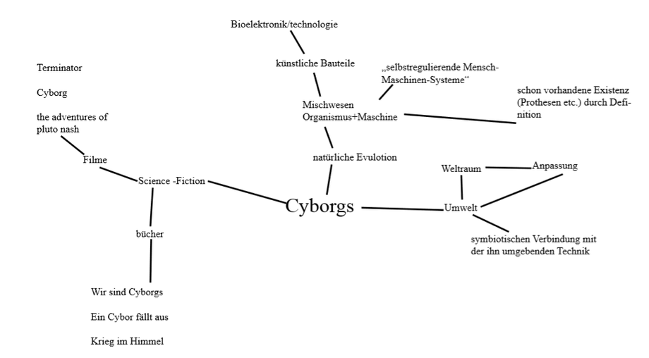
To edit the task, I have selected various Internet sources and different key points/words that fit the topic. My sources were
1. http://de.scribd.com/doc/2962194/Cyborgs-andSpace-Clynes-Kline
The script "Cyborgs-and-Space" is about the technical developments that humans need to survive in the universe.
2. http://www.heise.de/tp/artikel/2/2043/1.html
The article "From biological man to posthuman being" deals with the idea of the posthuman human being and its probability of implementation.
I then combined these into a mind-map.
Project sketch
My project idea developed in the middle of the semester when the course Scenography talked about the topic of the cyborg and the participants of the course had the task of researching films etc. on the subject . In the processing of the task I have selected different Internet sources and selected different key points/words that refer to the topic "cyborg" and put them in a mind map in relation and these with my already existing knowledge obliged.
During my research, I discovered a painting by José Clemente Orozco – Hernandez Cortés as a machine man (ca. 1938), which served as an inspiration for my idea.
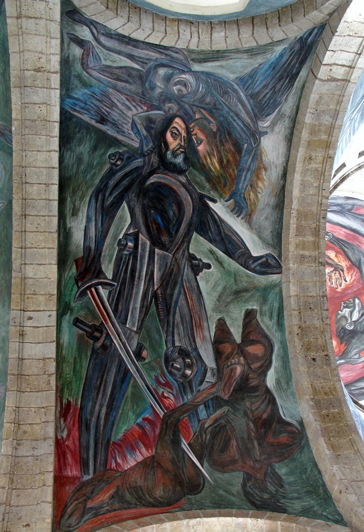
Unfortunately, I did not find any background information for this picture. During my research, I came across the topic of biotechnology and artificial spare parts as well as the discussed future versions of the posthuman human being on whose topic my idea is based.
My idea was to paint a painting (potrait) on canvas. The motif is half of a human face and a robot.The statement of the Poträt deals with the topic of cyborg and what the future of artificial components looks like for humans.
Design Parameters
At the beginning of the development of the painting/potrait I had to think about the following criteria
- Size of the canvas: 15 x 25 cm
- colour type (acrylic, oil etc.):Acrylic
- Style: Comic,Pop-Art
Final work
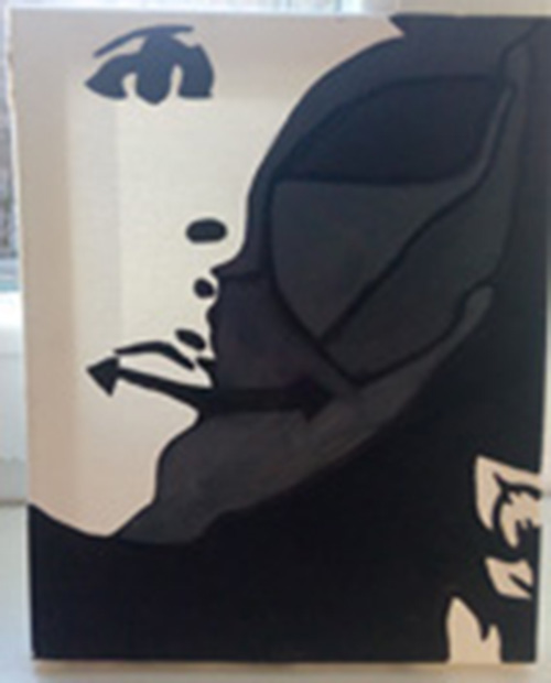
The result is a potrait in which the ambivalent forecasts for the future of the state of man (development of physical spare parts, physical modernization of human beings).
Strengths and weaknesses of work
strength
The strengths of the work are that the Potrait
- Statement/message
- the statement becomes clear only when one deals with the topic
- the topic cyborg is processed in an artistic perspective
weakness
Weaknesses of the work are that the potrait is that
- the statement could not be be clear at first glance by some viewers
- small canvas format
Visual Design, Screen/Communicationdesign, Information Design, Interface/action Design, Personas, Quality Interviews, Human Centered Design, E-Participation, Digitalisation
bachelor thesis
Participation (lat., noun participatio from latin, noun pars: part and Verb capere: catch, seize, acquire, take, etc., means partial detention, notification) is translated with participation, involvement, etc."
The concept of participation is becoming an important concept of 21st century. The percentage of voters of the German population for various political elections is declining and the Politics responded to this trend with the method of E - participation."eParticipation is the participation of people in social, cultural, political administrative processes and decision-making through information and Communication technology "
a mixture of traditional participation opportunities with the possibilities of the Internet .
The "e" in E - Participation is an abbreviation for electronic and is an extension of the traditional methods of participation. Moderation,which "will be media-competent and also strengthen the promotion of media literacy among the parties involved in the process should."
Many youth institutions as well as youth work uses E - Participation such as the Youth Network Berlin, which developed Berlin Youth Portal as well as a mobile application created for Young people with different offers. Offers range from Leisure activities to school information material. In addition in September 2012, the "Berlin Alliance for E - Participation" was created "on the initiative of the Youth and Family Foundation of the State of Berlin, the Kreuzberg Children's Foundation and the Democratic Youth Foundation." The Kreuzberg Children's Foundation provides financial support for children's and youth projects of other institutions, awards scholarships for a school year abroad and develops a project for children and Young people in Berlin. "The Democratic Youth Foundation is an independent non-profit Foundation of public law.
From own and external funds, the Foundation promotes Democratic youth projects of youth participation, engagement promotion and democracy development."
This merger is already trying to exestating in Berlin forms of youth participation, as well as the use of opportunities - and Dissemination of E - Participation in areas such as youth work, school, etc., as well as political and cultural education and urban development". For this claim,
the Berlin Alliance facilitates Participation - Measures of Young People by online procedures (such as online discussions and voting) ,the Qualification of multipliers, the representation of interests towards politics, administration, politics and the economy, as well as for the dissemination of successful E -participation procedures, so that Berlin is positioned as a model region for E - participation in Germany.
In my bachelor's thesis, I will research on E - Participation , E - Government, E - Defining democracy and youth work as well as E - participation in youth work (criteria, etc.). Furthermore, I will present opportunities for EU funding for participatory projects. and the Berlin Alliance for E - Participation. In addition, in the bachelor's thesis two sample projects of the E - Participation will be presented,analyzed and evaluated on the basis of the presented criteria for the successful implementation of a project and in conclusion, evaluate the chance of success in youth work.
In the practical work, I explain the task, define materials and methods, and to use a questionnaire to define the objective of the task. Furthermore, I planned a workshop to develop the application for the girls' centre to change scenes, in which
with the participants all steps of developing a mobile application will be worked on. On the basis of these results, I will release the final version for the respective results of the create workshops.The final result is a scientific dealing with the Bachelor thesis and the results of the Development of the application for the girls' center scene change.
In the end, i would like to have a discussion about the strengths and Weaknesses of the application as well as future developments work out.