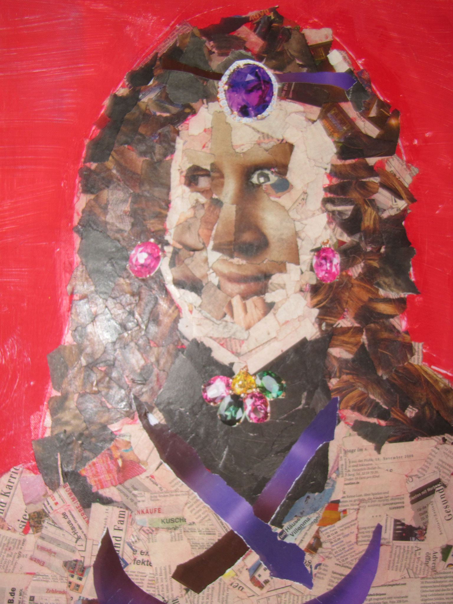
6.Semester - Saturn
Saturn, is the ruler of Capricorn, which is my ascendant. In Greek Mythology, Cronus was one of the Titans, and the father of Zeus. Cronus ate his children to prevent himself from being dethroned as the King of the Gods. That is, until his wife, Rhea, tricked him into swallowing a stone when Zeus was born.
In astrology, Saturn is associated with restriction and limitation. Where Jupiter expands, Saturn constricts. Although the themes of Saturn seem depressing, Saturn brings structure and meaning to our world. Saturn knows the limits of time and matter. Saturn reminds us of our boundaries, our responsibilities, and our commitments. It brings definition to our lives. Saturn makes us aware of the need for self-control and of boundaries and our limits.
This Semester gave me a break of Student life and gave me a Little insight on how working life can be...And like Saturn which brings structure and meaning i worked on that in this Semester - to have more structure .
Internship
When i thought About to do my 6-Month of an internship i knew i should somewhere unique and different than expected in my field so i can highlight myself from the norm , my cv and experience of the thousands of other applicants. I decided to my internship in a youth media centre for Girls and Young Woman which i visited when i was a Teenager. This gave me the possibility of working independently on various Tasks, being able to support the Young Woman on various design or media Tasks and learning how to work in a Environment , where different staff who are working in different Areas work together to a specific Goal - supporting the members of the youth centre to fulfill their maximum potential and realising their Goals.
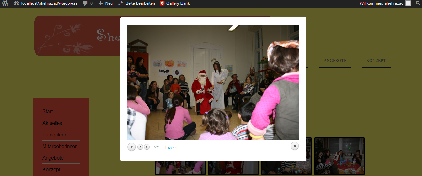
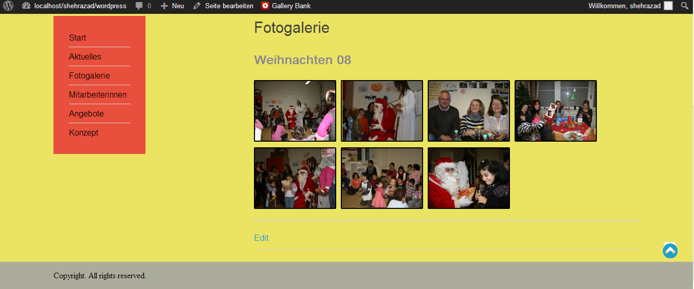
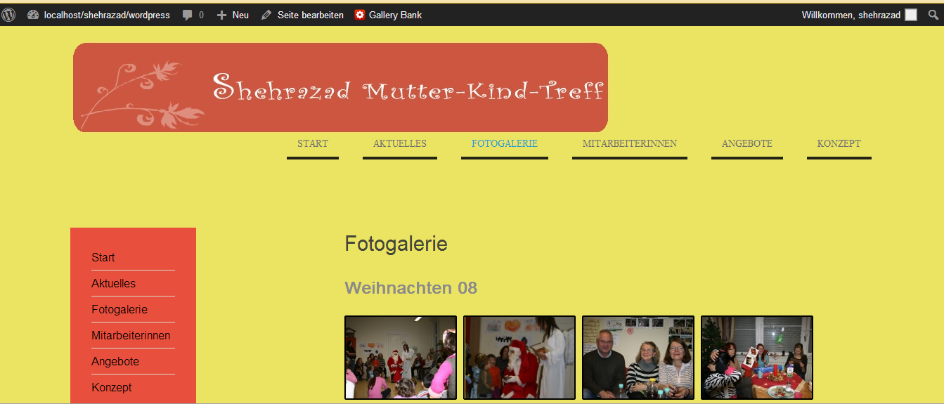
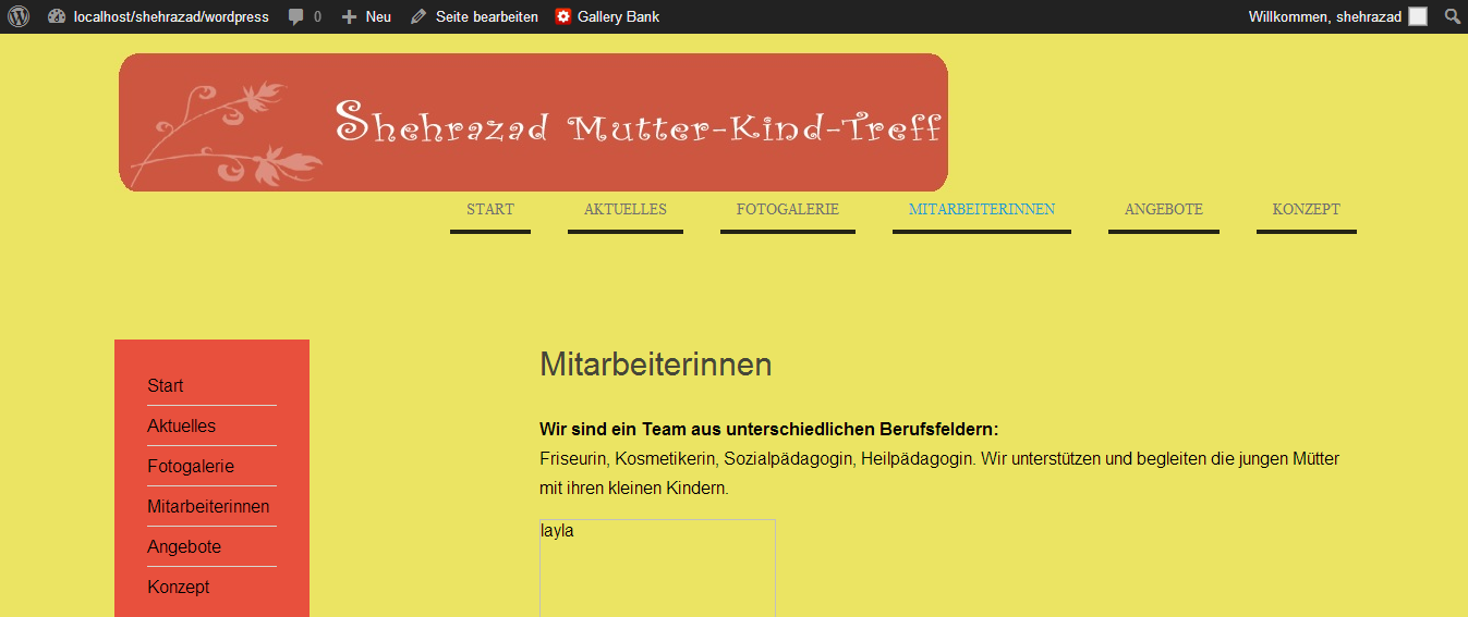
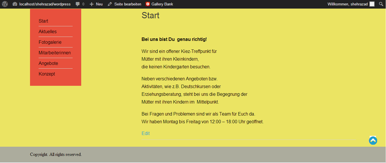
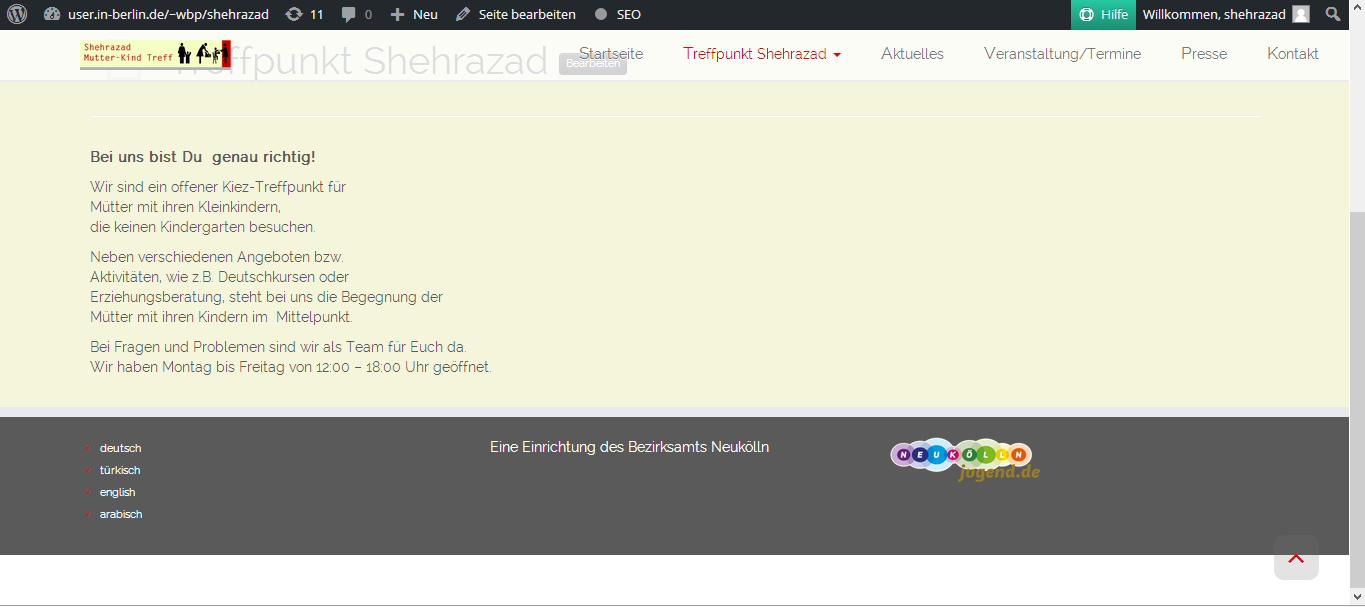
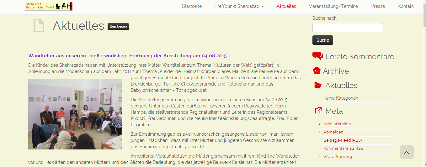
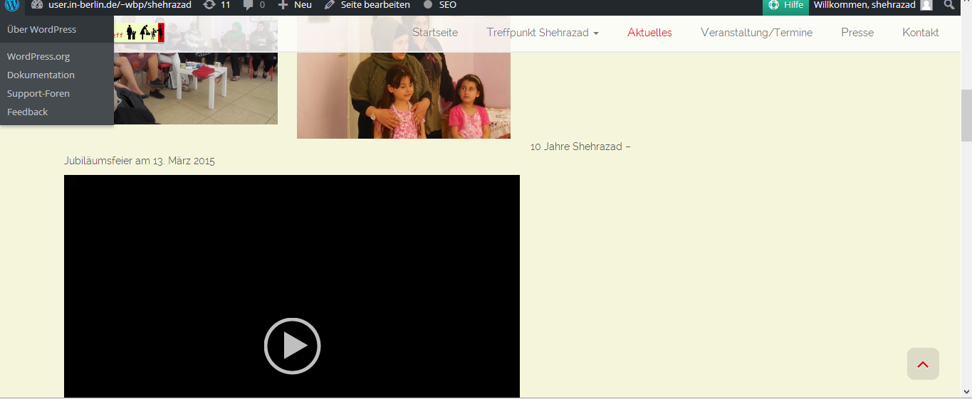
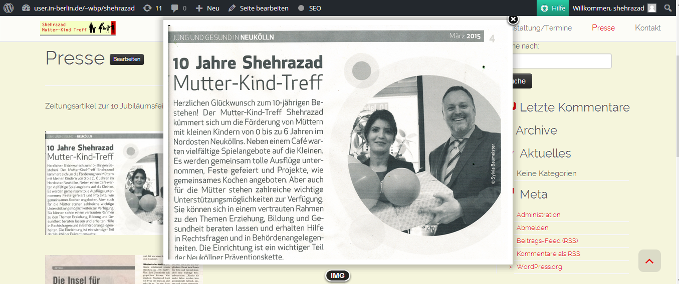
-What is the function of the internship institution? The Girls' Center Szenenwechsel is an institution of the district office Neukölln in Berlin and exists since October 1992. It is open to girls and young women from different cultures from 9 to 24 years. The facility is an institution of the district office Neukölln which offers girls and young women the opportunity to use various offers to develop their creative skills etc. In addition, the institution has a media literacy centre where visitors learn how to handle various media and computer programs properly. - How is the internship facility structured? The institution is staffed by a head, deputy manager and respective staff, who are responsible for various areas (e.g. media literacy). There is a flat hierarchy between the employees. Close cooperation and constant exchange is very important. Regular team meetings are an important part of collaboration.T he internship facility is also divided into different areas of work. (School education, creative work, musical education, crafts, media literacy and support for individual problems) The institution offers musical education and young people have the opportunity to form bands and support for the learning of instruments as well as practice/creation of music pieces. In addition, the institution offers support in the preparation of application documents, offers homework assistance, helps in the creation of presentations, websites, blogs etc. and in handicraft activities such as sewing, knitting, etc. as well as creative activities such as to paint. - What tasks were put in the internship and how were they worked out (documentation)? My first task was to create a slideshow for the 0th anniversary of the mother-child meeting Shehrazade on March 3rd, 2015. First,I visited the Shehrazade to search for existing images to discuss the concept of the slideshow with the shehrazade employees. The concept was that at the beginning of each year from 2005 to 2015 to show a girl who has been visiting the Shehrazade since the beginning and followed by three other pictures from the Shehrazade from the respective year. This concept is intended to represent the Shehrazade as a companion, educator and counsellor for raising young children into adolescents. I created the images with the speech bubble as well as the initial image and the end image in Adobe Photoshop Cs2, the pictures and music I then inserted in Windows Movie Maker and added suitable animations.
Motion Design, Visual Design, Photo Edits
Celebration Video for the mother-child meeting Shehrazad

The strength of the Video is that it Shows the different aspects how the mother Children Meeting place Shehrazade supprts the Mothers in raising their Children through games, cooking and Eating together etc. The speech bubble should create a more direct intimacy and interaction between the People shown in the photos and the Viewers of the Video. An improvement Point would be that there could have been more design Elements in the Video which would made the Video more lively and colourful.
Visual Design, Information - and Communicationdesign, Editorial Design
Postcard Developement
Then I got the task to create postcards for the youth centre and the Sherazade as well as to recreate the website of Shehrazade in WordPress.
A team meeting discussed the occasions for which the postcards should be created. The occasions were Christmas, Easter, Mother's Day, Birthday,Thanksgiving and Everyday Life. Then I did a
benchmarking of postcards and collected some postcards as inspiration for the postcard wrapping.
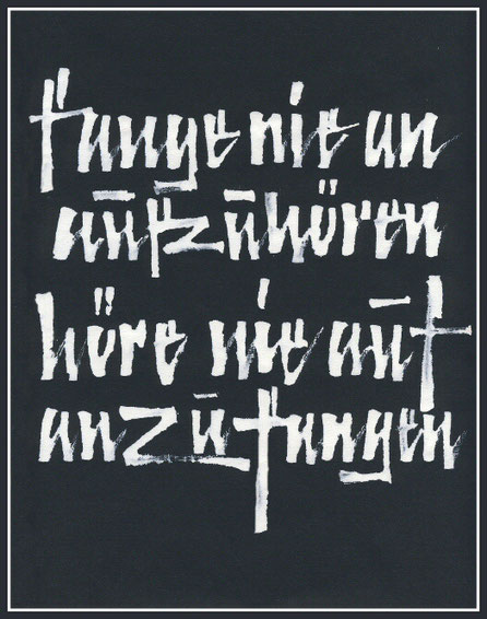
https://kalligraphie.de/schreibertreff-kalligraphie-im-ganzen-land/
I found this Picture as an Inspiration, because the typo fits the hiphop style that Teenager and Young adults very like and i wanted to include this style in my postcard design if possible.

For some postcards i wanted to use only typography and i liked the idea of using to seperate Fonts with contrasting Colors.I also like the contrast between 3D and flat.
I was inspred by the Colors because it fits to the theme and working field of the youth centre as well as their cooperate identity. Children, Teens and yoing adults from different migrant Backgrounds are visiting the youth centre and i wanted to express that in the postcards.
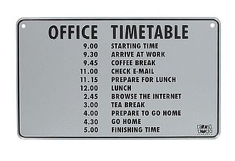
One of my Tasks were to incooperate a timetable with all the free offers the youth centre was offering at that time.
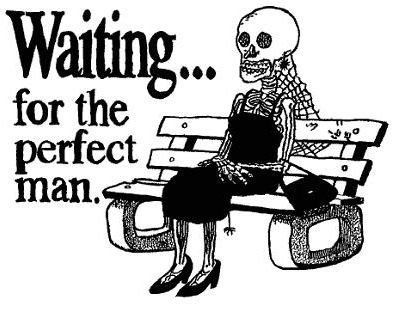
One of my postcard - idea is to firstly use drawings and black humour. because i think Humor is always good way to get the target audience to Keep you in mind and get their Intention. In Terms of the centre which is specialised in work with Girls and Young Woman it is important to use humor that is specialised in Topics that they are interessted in.

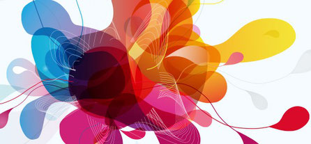
Also, one of my postcard ideas is to incooperate different forms and Colours in there like an Color Explosion because of the multiculturel Backgrounds of the staff there and the Visitors. It also represents the different offer Areas in art and science.
Postcard designs


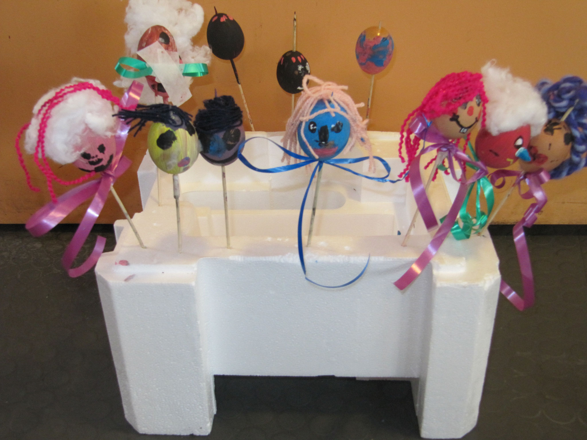

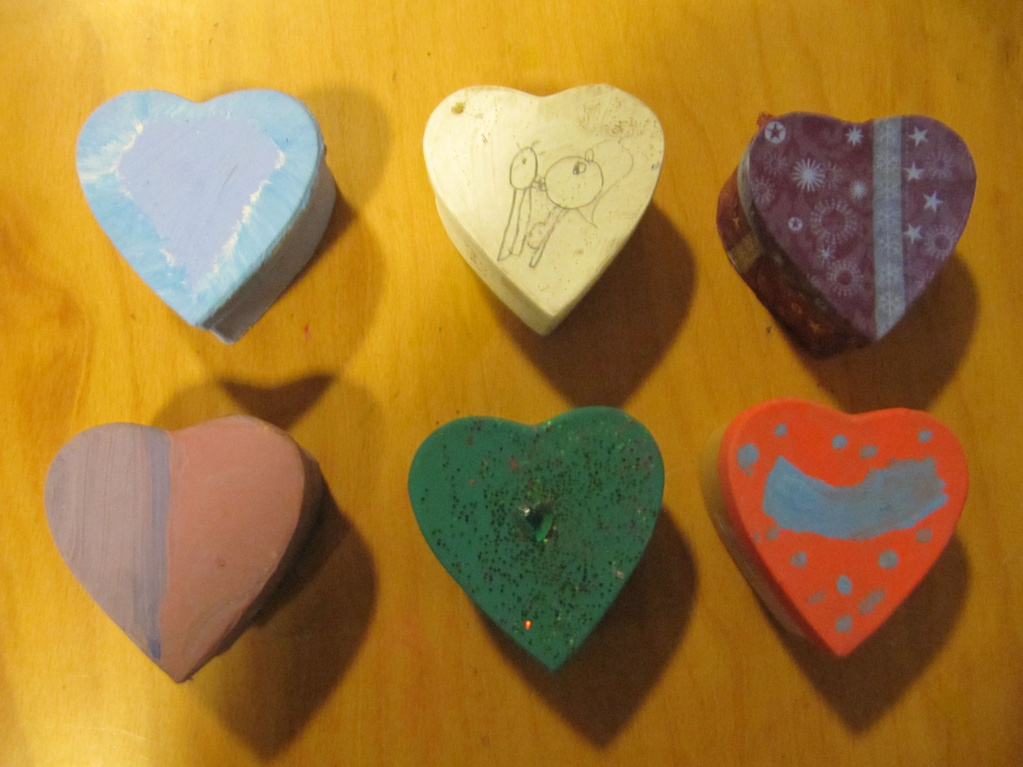


The Slideshow Shows all the Pictures that i took for my postcards designs. All the Pictures were taken in the youth centre. I photpgraphed everything that i thought could be a Motive for possible postcard designs. Everything was intuitive and Nothing was planned. Some Pictures are showing Details or part of a whole object.
fINAL pOSTCARD dESIGNS
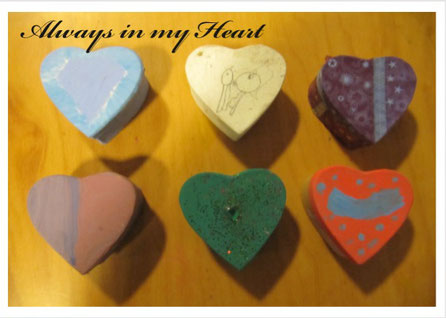
I Chose this Motive of all the above because i thought it would be a good Motive for mothers/fathers day, birthdays or valentines days.
Moreover, i liked how how the shadows look. The sentence " Always in my heart" sounds clichee, but i think it really fits the Picture.

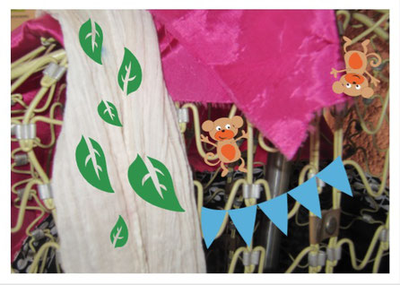
i likes this Motive very much and i felt inspred. Moreover, the youth centre offers handycraft and sewing, so it promotes their offers. "Im in love with my hat" should represent the enjoyement on crafting something on their own.
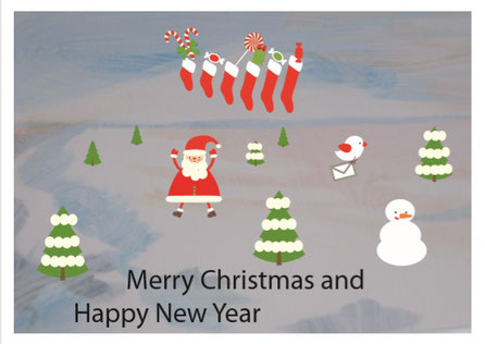
The Background of the postcard fitted to the Christmas - New years Season and i added some Holiday themed figures like santa clause or snowman.
The design of this postcard can be used for Promotion through the whole year. It represents how the youth centre for Girls and Young Woman sees themselves - a place which allows them who they are irrelevant how chaotic or loud they are.They should have the possibility to express anything they want and how they feel.
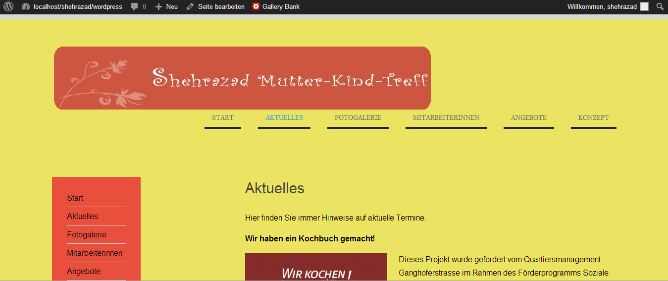
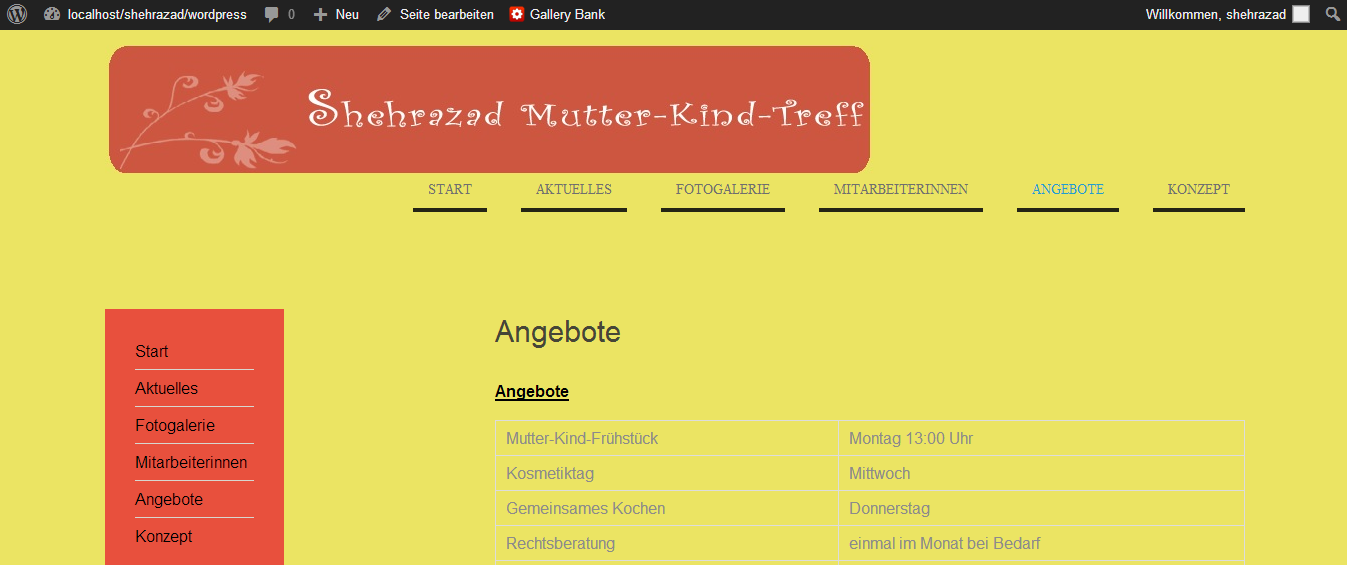
Website Developement, Screendesign, Interface/actiondesign, User Journey, Use Case, Flowchart, Wordpress, Programming,Personas
Website Developement for the Shehrazad
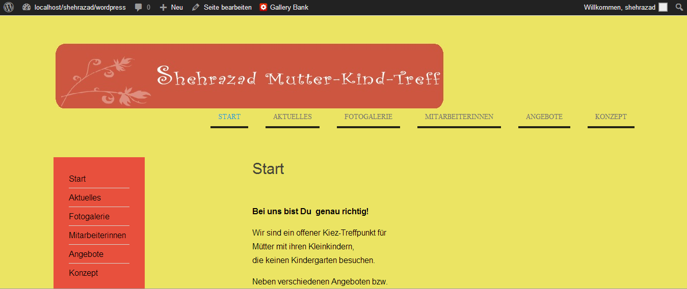
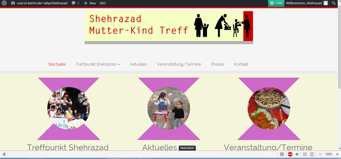
I presented two website design suggestions to the mother-child-meeting Shehrazd. The web pages are a replica of the old web page in WordPress and a new approach. They decided on the new design and individual changes were discussed. (change of background color, logo creation, etc.)
During the re-enamouring of the website, my internship management and I installed Xampp and WordPress. Then I was looking for a suitable theme and this I tried to change it so that it resembles the website of the Shehrazad. But after a problem, I searched for and changed a new theme with the help of my internship manager. By the way, I created another WordPress for the redesign of the Shehrazad website.


Research/Bencharking/Heuristic Evaluation
In order to get an overview first on already existing child-mother meeting place outhere i analysed three in depth to filter out what the website for the child-mother meeting place sherazade should contain and what to look outfor for possible mistakes ,
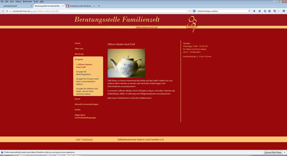
In this open mother-child meeting there is room to exchange ideas on topics such as development, breastfeeding, nutrition and everyday situations. This website has a simple, clear design structure and structure. This website has too bright colours, which is represented, for example, by the two basic colours of red and yellow, which occupies the largest place. This causes too much contrast and does not have a harmonious effect.
The website has an overview menu, whereby further menu points can only be seen when the menu items are clicked. The structure is suboptimal because a lot of space is not used, which could be filled with larger images or more text. The presentation of the images in the area of photo size could be optimized by the magnification. The language used is appropriate for the target group and no technical terms are used that may be incomprehensible.
Kinderwohl Berlin e.V. - Free sponsor of child and youth http://www.kindeswohl-berlin.de/
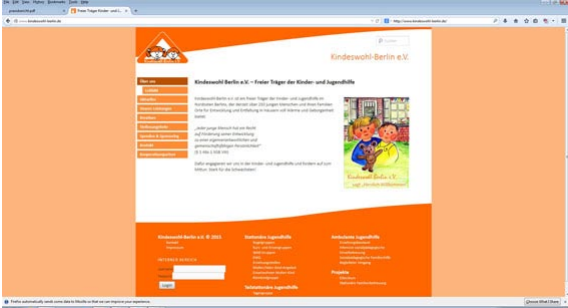
Kinderwohl-Berlin e.V. is a free provider of child and youth welfare in the north-east of Berlin, which currently offers more than 250 young people and their families places for development and development in houses full of warmth and security.
The website has an overview menu, whereby individual menu items are clearly delimited. It also uses simple and user-friendly language. The language used is appropriate for the target group and no technical terms are used that may be incomprehensible.
Errors are not possible because it is not possible to enter adresen, e-mail addresses, etc. The website gives users an easy-to-remember flow through shortened click options. To do this, the website has an appealing and clear design as well as a good colour tuning (white and orange). Nevertheless, there is a lot of open space that could still be used. Images are easily recognizable.
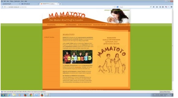
The mother-child meeting MAMATOTO in Landau offers for one and a half hours an opportunity to exchange information on the everyday issues of young mothers.
Every second meeting there is a specific topic on the program, which is presented either by the midwives or a specially invited specialist (could also be a man) and discussed in the circle of mothers
This website mother-child-meeting MAMATOTO offers visitors overview menu and user-friendly language, while avoiding specific technical terms. In addition, breadcrumps are not necessary as you will be advised on the left half of the page if necessary by means of a submenu/categories, which appears in red when clicked. The website design has been developed to suit the theme/offer and offers a good colour matching. (orange and green tones)
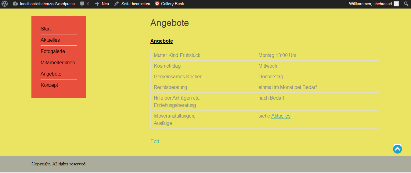
Then I wrote down various bulletpoints/categories, which I should pay attention to when setting up the website. When developing the website of the mother-child meeting place Shehrazad, I should make sure that the website has an overview menu as well as design. In addition, the website should have a page structure that makes the most of the space to be offered. A user-friendly language is very important because at the mother-child meeting place Shehrazad many mothers come from Arabic or Turkish speaking countries and specific
technical terms should not be used. In addition, the design should be developed to match the theme/offer of the Mother-Child-Meeting Place Shehrazad. However, it should not have too many colors or a too childish design as the website is created for adults not for children. In addition, the website should have a good color sheme so that the website works harmoniously for the Eyes The website should also contain many pictures to present the various offers and excursions.
Conception
After doing the scientific research, I created a user journey and flowchart for the website.
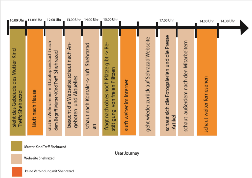
Flowchart
Unfortunately, I couldn't create wireframes and website designs because the website has to be completed within my internship period and I had to start with it relatively at the beginning of my internship period.
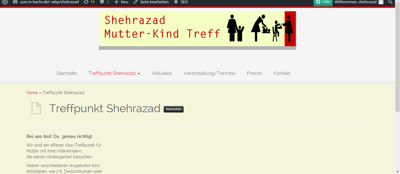
When I recreated the replica of the website, I decided on the WEN Business template. It took me two weeks to recreate the website. In Illusttrator I had to recreate the shapes of the menu. In addition, I created a screenshot of the website of the old Shehrazad website to cut out the header of the website and add it to the website.
One of the essential points was to find the matching colors and use the graphics used in the early developed web page and place the menu and graphics in the right place. Through the adjustment function I inserted the header and the shape background. I should only work with the css template if possible.
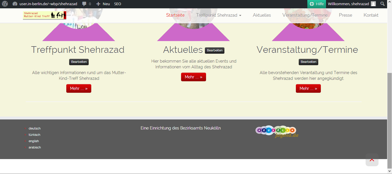
Then I should edit a preselected template from WordPress with the name Customizr and fill it with initial content. The following changes should be made to the design. These two created web pages in WordPress I introduced to the mother-child meeting Shehrazad. They have chosen the newly created theme. The following changes should be made to the design. The white background is more like "hospital"/sterile - > The background should have a beige tone - further menu items should be added like press and events - logo should be created - The pages should be translated into Turkish, Arabic and English.
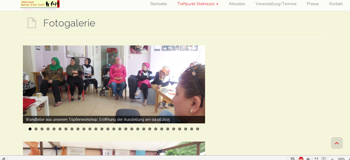
The first thing I did was create more pages and add them to the menu. Then there was the problem of missing material because it still had to be created and I could not work consistently in the programming of the website. The other problem was to find suitable images for the three categories that are shown in circles that should be appealing to the visitor and recognize which categories are represented. We also had to figure out how to adjust the background color of the circles with those of the changed backgrounds color. I also created the logo using Adobe Illustrator CS 2. When creating the logo, I tried to find Illustrator templates Mannequins that fit and customize them to the tasks of the mother-child meeting. I saved the Illustrator file as Adobe PDF and saved it in Photoshop as an png as well as integrated in the layout. with the customization function header. In addition, I added the search function, archives and meta function as well as the possibility to write and read comments, For the photo galleries I had to make sure that I find a plugin with unlimited number of photo galleries that can be created
On 29.04.205 I presented two website design suggestions to the mother-child-meeting Shehrazd. The web pages are a replica of the old web page in WordPress and a new approach.They decided on the new design and individual changes were discussed. (change of background color, logo creation, etc.)


Review
The project task gave me the opportunity to work independently and relatively freely. I did not have to work on a fixed plan and was free to tell when I had to work out what, but with regular feedback from the other people involved in the project (the head of the mother-child meeting Shehrazad, trainee ship management). This project also helped me to develop my knowledge and work with WordPress. In addition, I got insights into how working or collaborating with a "customer" or order emanator works and how to interpret and implement the feedback.
Strengths and weaknesses of the project result
Strengths : The strengths of the project result is that it includes all the desired functions and desired changes. It is clear and also contains more functions and is more up-to-date than the old website. By creating the website with WordPress, it is now easier for all those responsible for the website to update the website and to change it.
Weaknesses : All desired changes accounts are not realized during my internship period because this material and the cooperation of the mother-child-meeting would be necessary and this was not possible in time but is still feasible in the future.
Information - and Communicationdesign, Visual Design, Editorial Design, Print Design, Icon Design, Color theory
Icons
In addition, I had the task of finding icons and typography of a control system for the centre for people who lacking reading skills.I have selected three examples each for icons . Next, you should edit the selected icons.
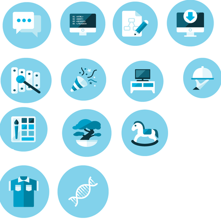
There are certain characteristics why i Chose this Kind of design. I liked that it is more 3D and complex than the others but in a more childlike and simplistic way. It feels more touchable and innocent and therefore you get a warm pritected Feeling by seeing the Symbols.
Moreover, there are many Options to modify it
(different Colors, the Symbols can be changed,raund Background can be changed etc.)
This design was Chosen my the staff of the centre. The next is to develop a Guidance System with the modified Symbols.
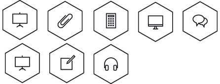
I Chose this type of design because it is simple and there is room for changes and modifications (Color etc.)..Moreover the Symbols are easy to understand for what they stand for (hedphones for Music room and calculator fot homework etc..)
This design is similar to the design above in Terms of simplcity and all Symbols are easy and fast to understand. What i like that the Colors fits the logo design of the centre so there is a relationship and association there.
The original design was completely black and i put some orange tone Colors to create a contrast and to make it more lively.
it also shows that the centre respects and supports the individuality and unique qualities of every visitor, who wants to take part in their activities.
Final Icon system


Review of the design
The Design is fitting to the target audience and every symbol is easy to understand. The pastel colors is pleasing to the eyes and gives the feeling of a relaxing and light atmosphere, It represents the centre in a indirect way.
plaque of Action Alpha Competence
The girls' center scene change received a plaque of Action Alpha Competence . In the Alpha Competence Training Courses, which are aimed at institutions or sub-institutions, an action plan is drawn up in addition to providing basic knowledge, with which institutions will overcome the barriers for people with a lack of written language skills. can reduce the amount of The "Alpha Stickers" will be awarded to these institutions after implementation and written fixation of the action plan. This allows the facilities to make your acquired competence visible to all at the door of your facility. On the one hand, it shows your commitment and awareness of the target group, on the other hand it signals to those affected that they can expect appropriate advice and can talk openly about their deficit.
Presentaionmethods/design, Programming, Clickdummy, Applicationprogramming
Girls day
In addition, I was to present a former project work from the 5th semester on Girlsday . The project is a jeweler application that I have developed. With this application I should explain the design and usability development of an application. I also helped the girls create a to-do list app.
My Review on this experience was that it is that presenting something to young teenage girls is different than presenting something to adults.
Teenage gitls are very honest in their facial expressions so you can easily read whether they are bored,confused or interested. Adults are more controlled in their facial and body language.
It was insightful and fun to helps the young girls in their developements of the to-do list clickdummy for their smartphones, You get an insight what is easy to understand and in which points is ore difficult and not really instinctive.
Programming-workshop
I took part in a game programming workshop at my internship company. Here we have programmed several small games with the application /programming language Love and an editor in which we have typed with the help of several templates and if possible changed according to our wishes. The games are once a cat graphic that opens the mouth when clicked and plays a Miau noise. The second game is a cat-and-mouse game where the cat is supposed to catch mice. The third game is a music game consisting of different color squares and playing different tones per square.
Logodesign, Visual Design
Logo-Creation
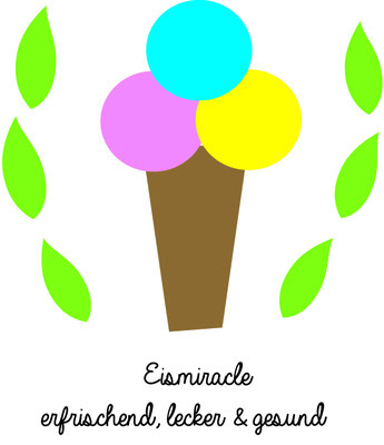
I created a logo for a girl's housework using Adobe Ilustrator Cs2. With the respective feedback I have created and changed different logos. The project thesis is a company that produces ice cream called Eismiracle.
Visiting google headquarters in berlin
On 09.06.2015 the Girls' Center Scene Change visited the Google headquarters in Berlin for a Presentation of Google projects as well as a project developed in cooperation with the Frauenhofer Institute in St.Augustin, which deals with the programming of robots made of Lego technology. For this presentation, three media competence center in Berlin were invited by Google. Programming robots is an open software with which you can link and modify robot commands. In addition, special 3D glasses were presented with which virtual spaces can be experienced in 3D using special apps. You can play games and watch videos in 3D. Another project is Google Open Gallery in which you have your own gallery online exhibition and these can be integrated into websites. Another project was new games that Google has developed, for example by building a house out of Lego in Chrome and looking at other buildings from other users. You can run it on your laptop, phone or tablet. Once you've built something, you can post it on the map and share it with your friends. With Build Academy you can be trained as a master builder. There are a number of interesting challenges in different locations, unlocking new Lego bricks. You'll also find many characters from the lego movie®
developing of the youth editorial office
At the last 2 Weeks of my internship I got the task to help with the developing of the youth editorial office. My exact task was to accompany and support the girls and young women in their ideas until the final article. I supported the girls and young women with the idea and they have already started to conduct interviews.
I cant present any further developemt of the subject because of the end of my internship.
Review on the Internship
The Internship gave me an interesting insight on how indirectly you have a lot of tuchpoints on design and you do not have to necessarily have to work in designagency or mediacompany. Moreover, it gave me the opportunity to work with people who have liitle knowlwdge about media- and communicationdesign and it helped me to experience certain problems that can arise of that lack of knowledge. You,as a designer, has to learn
- to interpret what peole really want to convey because they do not know how designer communicate their opinions and ideas
- to convince people about your idea without using specific words that they do not know.
This experience gave me the opportunity to be responsible for all work related areas and how that can be overwhelming but also freeing. I was always a person who liked working alone because of my personality and my experiences. Teamwork can only be productive if there is a shared understanding and openess between the members and also a trust everyone do their task on time. Moreover is is important that you should help out one another. In my previous semesters i had both good and bad experiences with teamwork so i learned that sometimes it is better to work alone which often times is more effective and design-process is faster.
My work relationship with my collegues were like this - they give me feedback on my designs and i tried to inccoperate it to my evelopements as much as i can. A problem that can arise by that is that if there is a polarisation on opinions you as a designer hast to evaluate wich feedback is valid for you and which will not work. As much as you want to be objective in design ist is not enterily possible so you have to have a strategy to convince all coworkers on your design so everyone is contempt with it or at least can see the reasining of certain designs.
My supervisor gave me a lot of freedom to experience and develop my tasks there and helped me a lot in terms of thechnical related issues.
After all, i think this internship helped me a lot to get insight how real life work would look and how to adjust to different kinds of professions.
-
.