
5.Semester - Jupiter
Puhhhh....The trip between the previous planet and the landing on Jupiter was quite a ride. Now its all about the present and structured team work. In astrology, Jupiter is associated with the principles of growth, expansion, healing, prosperity, good fortune, and miracles. Jupiter governs long distance and foreign travel, big business and wealth, higher education, religion, and the law. And if you look at the first project presented here it fits perfectly...Look out of the Window and see the everxhanging landscape of Jupiter.
Interaction/facedesign, Visual Design, Screen Design, Prototype, Game Design, Styleguide, Branding, Brand Management, User Interaction, User Experience
BVG
First IDeas
In this Semester the biggest Project was a Project for bvg - Berliner Vekehrsbetriebe. BVG is responsible for the public Transportation in Berlin and they asked for an Marketing Concept that would change,improve and innovate their brand and what People think of it.
The first Task for all students of the Course media- and communicationmanagement and the Course media- and communication design was to develop a Marketing strategy for the bvg.
My Inspiration for developing my Marketing strategy was actually my experience of using the bvg. Berlin is known to the world for inhabiting a lot of unique People. There is a saying that there is Germany and there is Berlin - it stands out, because of the mentality of the people who live in Berlin.
Berlin is a very contradicting City where all Kinds of People live _ poor - rich -, hardworking - lazy, polite - unpolite, normal Looking - crazy-Looking,old Buildings - new Buildings .The interesting Thing is that These contradictions can be seen everyday on the Trains and busses in Berlin.
For such a contrasting City it is obvious that interesting and weird Things happen there. People are inspired because of those contradictions and new Things can be developed and some could have suprising ideas which he or she or they want to convey to the public.
I witnessed People who just randomly Dances in the Train or a Group of foreigners singing are only small examples. This experiences i took as an Inspiration. I thought About and how to caption those weird and funny Moments.
My idea was to create an Instagram page where People can post funny,weird or abnormal Things and situations that happen at Underground stations, in the Train itself or on busses and anything that is related to the bvg (bags with a same Motive as the sittings spots of the tarin etc.)
 https://www.boredpanda.com/funny-subway-people/
Design Devolepement
After all students presented their ideas we had to choose the best ideas out of them and then Building Groups based on them.
I decided to be in a Group that decided to develop an interactive game that the bvg users can Play while they wait for a Train or someone.
The original idea was to create a Train driving simulation game, for that i created a storyboard for an imagefilm, where the user can learn how to drive a Train or a bus. There were different ideas how the game can be developed - having differrent Levels or obstacles, the user has to solve and overcome or driving different existing bus routes.
Besides developing the game one of the Tasks was to develop a storyboard for an imagefilm for the game that can be played on the the screens in the Trains and stations .
This was my Version.
Storyboard for the imagefilm
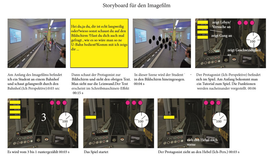
Scene 1 : At the beginning of the image film, I am a student at a train station and looking bored through the station. (I perspective):0:03 sec.
Scene 2: Then the protagonist looks at the screen and sees the text above. You only see the screen.The text appears in typewriter effect 00:15 s
Scene 3: In the next scene, a student is sucked into the screen 00:04 s
Scene 4: The protagonist (I-perspective) is in the game. In the beginning you get a tutorial about the game. The functions are presented one after the other 00:06 s.
Scene 5: It is counted from 3 to 1 down 00:03 s
Scene 6: The game Begins
Scene 7: The protagonist pulls the lever (I-Pers.) 00:03 s
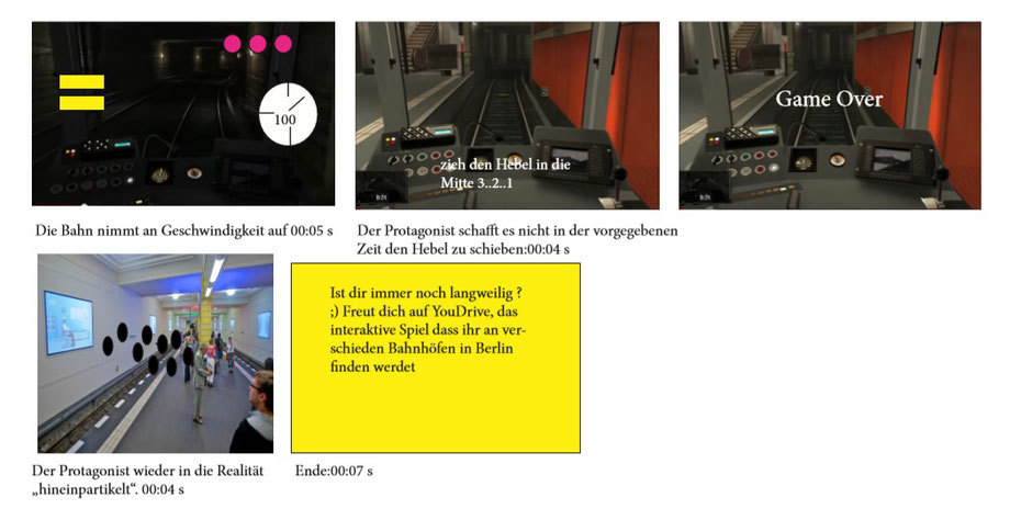
Scene 8: The track increases at speed to 00:05 s
Scene 9: The protagonist does not manage to push the lever in the given time:00:04 s
Scene 10: The protagonist "particles" back into reality. 00:04 s
Scene 11: You only see the screen.The text appears in the typewriter effect. End 00:07 s
As a Group we decided we have not enough time to develop such a complex game so we brainstormed which games can be played alone or with two People which People understand very easily and eay to Programm.
After a brainstorm session we decided to develop a ping pong game.
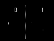
Pong was the first commercially successful video game, which helped to establish the video game industry along with the first home console, the Magnavox Odyssey.Pong is one of the earliest arcade video games. It is a table tennis sports game featuring simple two-dimensional graphics. The game was originally manufactured by Atari, which released it in 1972. Allan Alcorn created Pong as a training exercise assigned to him by Atari co-founder Nolan Bushnell. Bushnell based the idea on an electronic ping-pong game included in the Magnavox Odyssey; Magnavox later sued Atari for patent infringement. Bushnell and Atari co-founder Ted Dabney were surprised by the quality of Alcorn's work and decided to manufacture the game.
Concept of the Pong Game
Slogan - Are you still reading or are you already playing?
Starting position/problem: Waiting time at stations /during the journey etc. -> boredom, little communication with each other
Solution: Pong (BVG duel)
Message from Pong: With the Pong game you can make the waiting time in the stations or train journeys etc. exciting, get in touch with fellow human beings and break with the
everyday benefits of the train./ " BVG duel brings a bit of variety and fun into your everyday life.
The first step in developing the pong game were defining certain Parameters. In the file below are my defined prameters for the pong game.
Target group
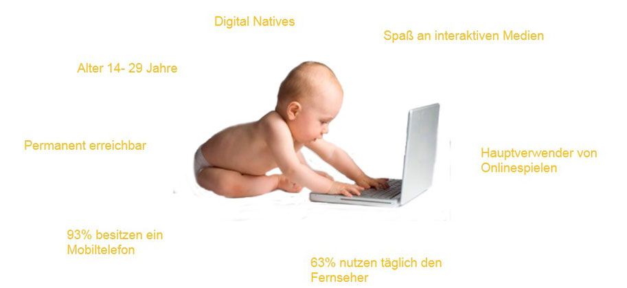
Bevor we started designing the game we discussed what target Group we want to adress in our game .
We decided on following characteristics.
Digital Natives I 14 -29 Years old I Always reachable I 93 % having a Smartphone I 63 % are watching tv everyday I Main Onlinegame - Users
First Design Drafts
After discussing the Concept i devolepd two design drafts for the game.
Other designs of my Team - members
http://bemoredifferent.com/pong/?fbclid=IwAR1GRr2jTk3P4aiExVcvZPZ0m2M7L846hcuYd1RLsYn9s5RrCFW_uIyee6c
Design of the Game
On the Basis of the discussion About the concept i developed my first design proposel for the game.
Screen 1
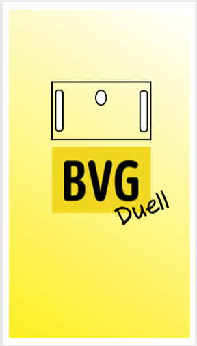
This is the start screen you see when you open the game-app and also tne interactive screen Version at Alexanderplatz.The Colors in the game are also used and inspired by the bvg logo, so the game is instantly recognisable.
Screen 2
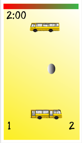
The second screen starts the Play.In the app you are the bus in the Bottom - use can move the bus left and Right through swiping the bus. In the interactive Version in Alexanderplatz it is possible to Play with two Players.In order to move the buses you have to move one step Right or left. When you stand Right to each other, the Person on the left is bus above and the Person on the Right is the bus in the Bottom. The game Duration are max.2 minutes.
Screen 3
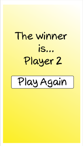
The last screen announces the winner - if the result is a draw, it will tell you the pont score.
User Journey - "The journey of the hero"
It is Always useful to brainstorm ways of how potential users get to know or find out About your product because it helps to define Marketing Strategies as well as potential Problems that must be solved before the game is published.
Before i developed the User Journey i defined certain criterias why the Pong game can be useful for the user.
Benefits for the end user:
- Pasttime
- competition situation
- fun factor
- interaction with other players
Topics: Communication,Entertainment,Innovation
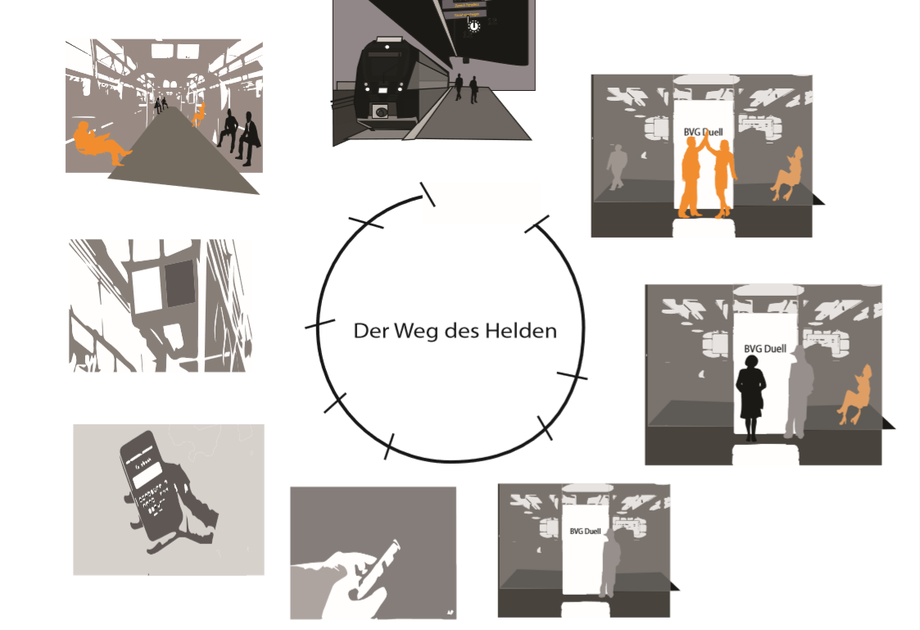
The first step of the user journey Begins at an Underground Station in Berlin with People wating for the Train while Looking at their phones,listening to Music. etc. Protagonist waits for the subway, looks around the station, sees people constantly looking into their mobile phones, or just looking around and waiting -> boredom, hardly any communication
The second step starts when the People entered the Train and the Train stars moving. In the subway: the protagonist sees a similar situation as in the station: people on their mobile phones, who read books, stare into the void or at the monitor etc.,avoid eye contact
On the Monitors at the Train an Advertising is shown About the new BVG - Game Pong. It explains what Kind of game it is and how to install the game on every technical device that is able to connect with the Internet. Protagonist looks at the monitor-sees the ad for the pong game for the screen at Alexanderplatz and the app
The third step is to install the app through the bvg Website or through Google Play and apple store.
The fourth step is starting and playing the game
The fifth step is sending their friends via facebook the link to the pong game so that they can also download the game.
The six step starts when the protagonist gets off at Alexanderplatz -> runs towards the customer center -> remembers the ad -> sees the screen with the start screen of the pong game -> stands in front of it, second person comes in and asks and can play along
The seventh step starts by the two Players playing the game on screen.
The last step would be that Protaginist wins -> both say goodbye and move on
Technical implementation and design
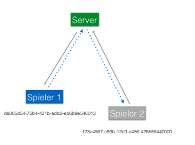
Server and App - communication
- one to two players can play the pong game
- All games will receive an ID that can be used to save their victories and to create a leaderboard for all gmars
Use of different screens
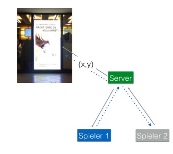
Since only the coordinates (x,y) are transmitted by the clubs between two games, this can be transferred to any additional medium
Pong as an event
- To improve reach, a viral social event is being made for digital natives
- We're sharing the event on Twitter with the hashtag #bvg
- We post the event on 9gag
- We interpret QR codes that refer to the app
Prototype BVG Pong
After the official assignment of this Project was over, the pong game was developed by different People ( I was not part of this Group and whether other members of the original Group i can not say). This short Video was the result.

The game works like stationary game console Nintendo Wii.You have to stand in front of the camera that it can registeryou and than you are able to Play.
Review of the Project
The Goal off this Project was to improve and if it is possible renew the Image of the brand bvg. The Image of the bvg was not very good.The People had Little or no emotional Connection to the brand. People used the Train because of necessity or of environmental reasons.
This Project was bigger in scale so to be able to develop more ideas that resulted in a decision to Combine media-and communication Management students with media-and communication design students. This decision was made because it helps to create a visual brand and Marketing strategy where These fields are needed.
We had three media-and communication design students and one media- and communication management student. Although there was not really a balance, we developed a balanced Concept of product/user experience design and Marketing. The media - and communication management Student did a lot of Research on the Target Group, defined our Tasks and Goals as well as described the consumer Benefits. The other Group members developed their own concepts of the pong game and were responsible for developing the User Journey/Experience and defining the game.
From my perspective we worked quite well, although objectively seeing there is in Imbalance and we as media-and communication design students would overtake and dismiss the opinion and suggestions of the media- and communication management Student.
The project went relatively smoothly without any Major Problems, obstacles or communication Problems. The Project gave us the possibility to look a product launching from different angles like Marketing,User Experience and Consumer Benefit and more Areas are involved that an outsider/consumer thinks. The difficulty for us was to try to be creative in a Situation where the game we wanted to recreate in the cooperate identity style of the bvg. Moreover in Terms of design it can not be to complicated because the game has to be programmed for big screens, so two Players can Play.
After all i think i learned that there are more Areas to consider in order to not create just a fun product but to create a User Experience that is good.
Information And Communicationdesign
This Course was very open in the Approach so the official Task was developed by our lecturer during it on the Basis of all the small design Tasks we were given.
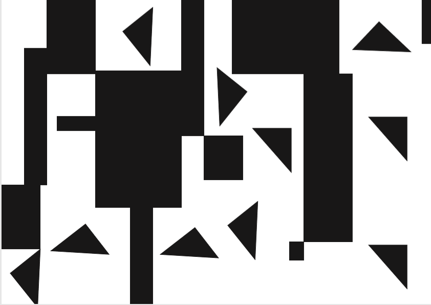
The first Task was to present the structure principles between Background.Foreground and the Basic elements circle, and line..
This was my developement of the Task.
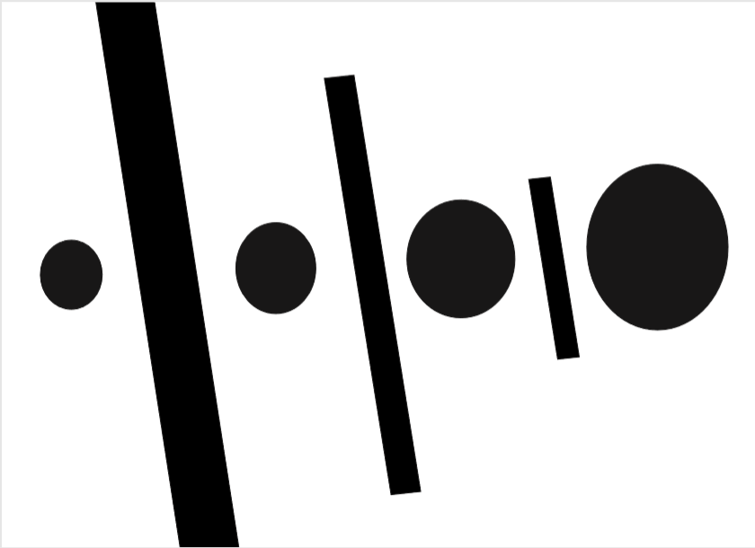
With this Arrangement i tried to work with opposite directions in size so the diferrence between oppsites size differences are shown.
The next step was to develop new arrangementa between Background.Foreground and the Basic elements circle, and line...
For this design task i only used rectangle and triangle. I wanted to create Rhythm through the relationship between the directions of the Abstract forms as well as the black Color of the objects and the White background.
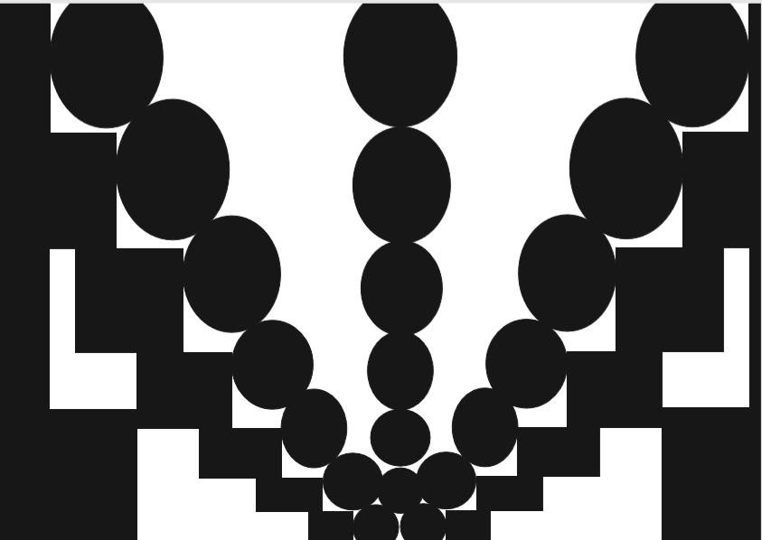
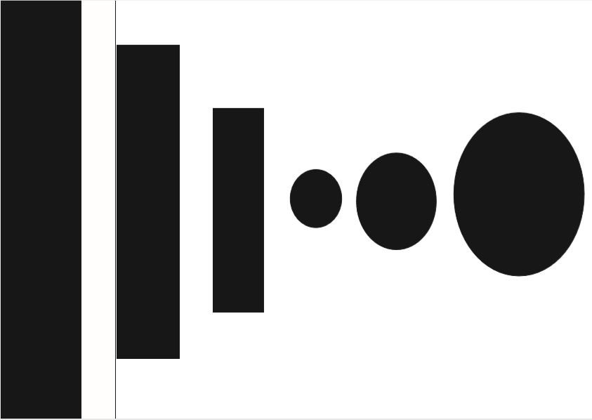
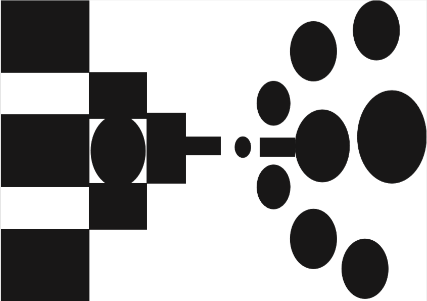
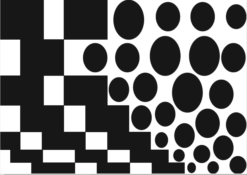


With this developement of the task, i wanted to use the contrasting forms of rectangle and circles and how these contrasting forms can create different designs, structues and spaces.
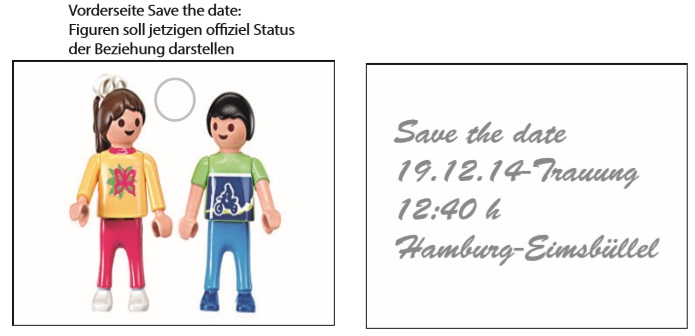
wedding InVitation
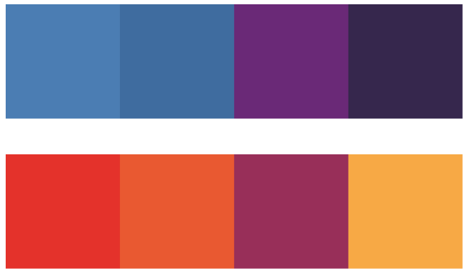
Before i developed first wedding designs i chose a color palette first,that i want to use for them. I wanted to use strong vibrant colors with cool undertones because a wedding is combination between tradition and emotions.
Design Proposals 1
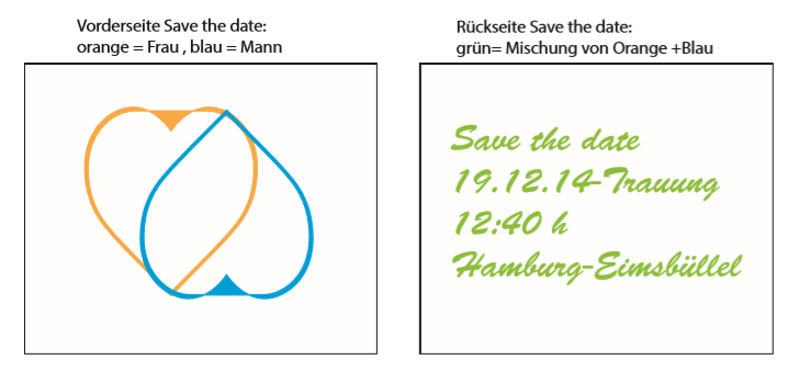
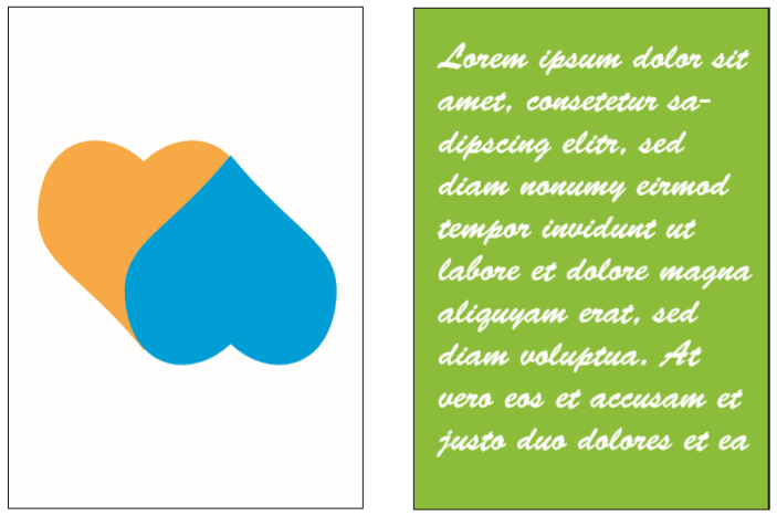


With this design i wanted to create a before and after effect. The hearts in the foregrund of the invitation is only outlined because it represents the emotinal connection with potential of new experiences and growth. On the background the hearts are fully colored which represents the new experiences and memories after the wedding.
I chose orange and blue as the color because if you mix them together you get green, which represents peace,Fertility and growth which represents values that are important in a marriage.
The same concept with the hearts i used for the textpages. The cart should express a transformation process.
design proposal 2
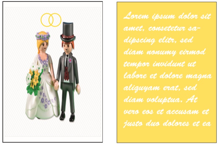


With the Playmobil i wanted to represent the childish vision of marriage and a typical story line in a love story - marrying your first love, which you meet often when you are a young adult. The details like the clothes of the playmobil figures in the foreground which represents a more youthful look and that there is a little space between them. The silver ring represents the engagement status which is also used in the typo.
The married couple in the background are instantly recognisable by their clothes and the flower bouquett the wife is holding.Moreover, the deatil of holding represents a depper emotional connection of the couple.. The two interconnecting and partially overlapping Golden Rings is often used as a marriage symbol.
Review
I think the designs are more playful and childlike for average wedding invitations but i think, that makes it more unique and gives a certain vibe how the wedding might be (more relxed, happy, spontanous, fun). I desgined the wedding invitations only on the limitated facts i got (place, date etc.) so i could freely design without any restrictions. I think that both of the designs inhabites a lot of symbolic meanings, that some invited people may not be clear in the first view of it, but if there is people who are knowledgable in meaning of colors they would get the message. Both invitations are clear in their message and i think underlines the aspect of love and the future..
Ecersise Position/Grid
The new homework was to create multiple grids (stretched,informula,formula,elegant) using an image and a heading.
tense: rather informula, seems rather stable, more tension when the image is moved more in a corner, movement by the overlay of image and heading
informula: picture rather center,text runs with the image
formal:equal distance of the webs, less distance between the image and the heading
elegant:golden cut (picture and heading),heading more content designed and set , heading more above the center, serif font or larger font size
Visual Design, Information - and Communicationdesign, Cooperate Identity
Name Design
With this exercise your own name should be visually designed on the basis on your own personal traits.
To do that i brainstormed all qualities i have - what my values are - what i am afraid of - what my hoobies are - how other people world describe me - how i would describe my characteristics
With the findings to each category i made a persona on myself.
First Designs
Developements

With the first design, i wanted to play with the letters and rearrange them so an interesting design can occur. I chose Neo-Green and Black because i used a similar color palette in a prevoius project( see third semester-cooperate identity) i think this two colors represents my personality the most. The very quiet observant and melancholic as well as the bubbly,free and funny side of me. It represents my often shifting moods and the different images people have of me. I have a very bipolar attitude on a lot of things and can seem very extreme. In some cases it is bad and my goal is it to try find a balance where balance it needed.
With the second design i wanted to try different effects on this came out.I like that it has many edges and brakes which represents my life until know. Always changing - good or bad - but trying to stay who you are at the core - through that journey. This design also represents how people react to me - often very extreme - they love me or they despise me - are confused or totally get me - want me change or want me stay who i am. Moreover, it represents my inner state of feeling - there are some mellow and some chaotic parts and my journey trying to understand those feelings.
With the third design i wanted to create chaos in a system. For me it kind of refelects my life - it is chaos in a system which is influenced by systems like family, friend, work, society. By nature i am outside thy system because of my peronality type. I never fitted anywhere - not at home, not at school,not at university and never was part in clique which you often have at school. I do not think i am so different that i can not live and work in those systems - i am very good in adapting - but my thought process is different than most people so to understand certain decisions by certain individuals as well as systems is difficult for me - this always related to problems in my life and misscommunication as well as understanding. To explain thoughts is easier set than done when you are taught to think a certain way by different systems which are very inconsistent and makes it difficult to develop a system that works for you. I am a person who looks out for patterns - what is related to what -and what causes what - in a chaotic system this is very difficult which results in my chaotic nature that can seem very sytematic and logical.
But as Nietzsche said "You have to carry chaos inside of you, to birth a dancing star"
Review
My Professor liked my conceptual approach and wanted me to develop designs for the feelings of Fear and Trying to adapt.
First Designs
Developements
With these two design approaches i try to convey the feeling of exclusion,isolation and trying to get/fit in.
The first design uses the symbolic of the lonely orange fish in a fishglas to express the feeling of isolation in a very tight-spaced area and the state of panic of the lonely fish trying to jump in the other fishbowl with the greycolored fishes. besides the high risk to die. The design gives a lot of room of inspiration and interpretations on how this story potrayed in this image can end.
The second design represents the mind of someone who is feeling cut out from the group and the confusion and unanswered question that goes through the mind. The Black and white picture of a woman sitting with her head down represents the dark and extreme emotions she feels in that situations. The grey background represents the feeling of no direction and the yellow figures symbolizes the triggers of that feeling. The amount of people gives a strong of feeling of crowdiness and being overwhelmed.
The third design should express Nachtangst, which expresses the fear of the night/darkness. The forest in the night typically expresses this fear the most and the Quote Der Mensch ist doch wie ein Nachtgänger, er steigt die gefährlichsten Kanten im Schlafe - "Man is like a night-goer, he climbs the most dangerous edges in his sleep " by Johann Wolfgang von Goethe.. My interpretation of that quote is that in your dreams you can be whoever you want to be without restrictions Moreover, in your dreams dangerous situation can be very blur like trying to see in the dark so you are more willing to take risks because you can not really estimate the danger correctly and you are more brave because there are no restrictions in your dreams.
review on the project
The project gave me the opportunity to take me as a person as the topic and muse as well as create something that represents parts of me that also can be universal and can evoke certain feelings to the viewer. As much as i used research method for my design inspiration a lot was very unconcious and i think it was very interesting how my unconcious feels. Although some might say human being are self absorbed and only think about themselves and tends to be more concerned how the environment responds to you and your respond to their respond. But to obejectively analyze yourself and how you feel and how others might perceive you is scary but eye-opening. You realise things and issues maybe you do not know before and work on things that maybe you decide yourself needs improvement. All in all this project allowed me to be creative and free in my approach which for me was very liberating because there are not really strong restrictions you have to consider like in other projects like keeping the Cooperate Identity in mind,target audience etc.
Visual Design, Information - and Communicationdesign, Magazine Design, Marketing
A MAgazine about Me
We got the task to develop a magazine about ourself as a person with the combination with the work we have done in this semester. My approach to that was to present the duality of my personality - rational/irational ,logical/ilogical, abstract/concrete, big-picture-oriented/detailoriented, wise/childish ,ideal/imperfection, black and white/colorful. boundaries/freedom Moreover it should tell the developement story of my character and whether i can manifest my future goals.
We did not have a lot of time to develop this task so their is a feeling of incompletion.
Carpet design
In this task, each student should create a carpet design which will take part in a competion by AD Magazine. The winning design will be reproduced as a real object.
Research and inspiration
The first step was to find Inspiration and possible motifes for the carpet design.
first designs
With this design i tried different effects in adobe illustrator and this designs came out. The two and threedimensional objects creates together a space that feels light and futuristic. This design is comletely created without any intention is a pre creation based on intution and experimentation.
With this design i tried to work with colors and layers and how the layering and the transparence creates new volors.
This design was inspired by a picture above and was an attempt to broaden the normal rectangle form of a carpet.
Choice of design
After the Presentation of the design drafts the group recommended to go with the third design. The next step is to develop the design even further and to make a pdf presentation that entails all necessary information in creating the carpet.
Here i tried to work with height of the different colors so that a more relief kind of surface can be acoomplished.
In the end we should present our design with all necesary information about the carpet design and a cv of the designer.
Review of the project
We have submitted all the designs and no designs were chosen as a winner.
I think for the readers of AD Magazine my design were to colorful and playful reminiscent to the 60s which is not normaly the presented style in the magazine. Moreover it would have been good that the unusual surface of the carpet would be highlighted and how the used material is colored as well as different hights of the colored parts of the carpet.
MOBILE APPLICATION FOR A JEWELERY SHOP
On 02.10.2014 Our professor for screendesign presented three project topics in the seminar Screendesign and Hypermedia. All three topics are smartphone apps that are to be optimized.
1.Theme: SmartHome app
This app is a control system for light, shutters etc. mainly for homeowners, but which will also be used in the future by offices, house management, etc.
2.Theme: CarConnected app
This app is an app that the company sells to car dealerships, which then offer to their customers. This app receives information/data/messages from the car and serves as a control system of the condition of the car. The goal is to optimize the app in design, user journey, user-friendliness etc.
3.Theme: Assisted Living app
This app is a communication tool between residents of a retirement home and employees. It contains various functions such as ringing employees, picking food, etc.
As a homework assignment, we should research whether similar apps are exescising.
smarthome
Functions:
- combination of heating control and household appliance control for homeowners, Apartment owners and tenants
- Connected device system consisting of sensors and actuators
- Modular design and therefore flexible and can be retrofitted at will
- Connection to the RWE SmartHome Backend via the Internet for the use of innovative additional services, services and device software updates by connection to the RWE SmartHome Backend via the Internet
- Installation without the help of the expert and complex cabling (PLUG & Play immediately ready for use) , graphical user interface. Remote access via the Internet and SMARTPHONE
- wireless solution based on the highest encryption standards for security and data protection. The possibility of firmware updates via radio keeps your devices up to date at all times.
-RWE SmartHome can be used anywhere in Germany and independently of electricity providers
Home automation
All devices can be controlled directly. For this purpose, profiles must be created in the house control system. According to your own needs, you can combine several commands in one profile.
When purchasing an RWE SmartHome head office 24 months mobile access included, then optional € 14.95/year. Access is still free of charge via the home network. Depending on the provider and tariff selection, additional communication costs may arise for mobile access.
The RWE SmartHome APP STORE is the gateway to the individualization of the very personal RWE SmartHome. This is because additional RWE SmartHome functions and services can be purchased via the RWE SmartHome App Store and activated for the very individual management and control of the system..
Because if you are looking for additional functions and services for your RWE SmartHome in the future, you will find the latest extensions in the RWE SmartHome App Store.
Ways. Because the additional functions and services are only installed when you need them, only the services that are individually necessary are paid for.
Belkin WeMo: Smart online sockets
For under 50 euros, users receive a Wi-Fi-enabled switching socket that can be operated via the Internet. Electronic devices connected to the "WeMo Switch" can then be switched on and off at any time, anywhere in the world, via a smartphone app. The app is compatible with iOS and Android.
The setup: Download the WeMo app, connect the switch to a power outlet and connect to the Wi-Fi router. In the app, then enter the configuration data of the router and start the app . You can create schedules for the switch to automatically turn on and off lamps, stereos, heaters, fans, or other electronic devices at predetermined times.
If you want more features, access the WeMo Insight Switch. According to the manufacturer, this is available at specialist retailers for around 60 euros and offers rules and automatic notifications. For example, you can be informed by push notification that the washing machine is ready. Graphical reports on energy consumption complete the extended range of functions of the device. Belkin also offers the WeMo kit, which includes a motion sensor in addition to an intelligent socket. For example, a lamp can be turned on automatically when someone enters the room. Cost: Nearly 100 euros.
OnStar Remotelink (Android, iOS, Blackberry)
With this app you can remotely lock the car doors and start/stop the engine, use the horn and let the lights flash so you can find your car. A vehicle finder shows you where your car is on a map.
When used with a gasoline-powered vehicle, you can view the fuel level and monitor the tire pressure from the app. Remotelink ™ 2 requires an active OnStar subscription and a compatible vehicle and mobile device.
Open RemoteLink and log in with your username and password onstar.com.
Launching the app
If you don't have a password onstar.com, just go onstar.com, click on "Sign in" account number of OnStar and zip code.
If you no longer know your account number, click on the link next to the "Account Number" field to receive it by e-mail.
The next step was to choose an application to improve or to create a new application. I decided to develop a design concept for a jewerly shop.
benchmarking
Expert-Interviews
Flowchart
Personas
User journey
wireframes
Final Design
strength and weaknesses of the app
strength: The user interface is inspred by the Copperate Identity of the shop, so there is recognition and familiarity for the customer. The interface is clear and does not overwhelm
someone with much information and colors. Moreover, there is a repetive structure and flow to the screens/functions and is aligned to similar jewelry apps. The design is oriented to the target
customer, so the app has to be clearly structured and easy to
use.
weaknesses: The design does not look very modern and can be a negative factor for a younger target group. It is also hard to tell whether it is an application where the customer uses it
over a longer period of time or moreover a specific tool to buy a certain product, without looking for other products. Moreover, it does not have an innovative tool or function that
differentiates it from other
competitors.
opportunities: Future additions to the app could be - live jewellery tester on yourself rhrough mobile camera -a more modern Looking user interface - creating a present box
Jewellery Website
The Task: Creating a Website for a Jewellery Shop
First Step: Benmarking
Christ.de
- appealing design for target group
- easy-to-understand language
- easy-to-remember sequence: breadcrumbs , watchlist
- Continuity
- Feedback through Text+Email
- Well-marked outputs through breadcrumbs
- Precise and constructive error messages
- Help and documentation
thomassabo.com
- appealing design for target group
- easy-to-understand language which, however, is replaced by English terms
m Menu field may not be comprehensible to some users, but they may not be able to
can be explained by clicking on the menu items
Gold and Silver Gallery
- easy-to-remember sequence: breadcrumbs , watchlist
- Continuity
- Feedback through Text+Email
- Well-marked outputs through breadcrumbs
- Precise and constructive error messages
- Help and documentation
.juwelier-foryta.de
- not appealing design for target group
- easy-to-understand language
- short processes,no breadcrums/watch list
- Continuity
- no feedback through Text+Email
- no marked outputs by breadcrumbs
- Error messages are not possible
- no help and documentation