2.Semester Part 2
You think that to take a little brake on the second Planet Venus is a bit early in the trip through universe but a lot happended already so i wanted to give you a little brake to process you first experiences.
Typography
The selection of the typography was re-elected on 14 May 2013 in a Joint decision-making procedure. The students chose between "Helvetica Neue - Ultra Light" and "Courier - Regular" and determined the former as the final typography. The font was chosen due to its apparent lightness. This supports the musical-harmonic design principle desired by the students.
Development of the flyer
On 14.05.2013 the course MKD 2.Sem. talked about the flyer design for the exhibition. The course of study has defined the contents of the flyer: - theme of the exhibition - date and time of the exhibition - individual descriptions of the projects using self-developed sayings - address + map of the location of the MHMK. Some students should be concerned about the typography, design and content for the flyer.
The first designs for the flyer were made in small groups, which were subsequently discarded. Individual elements were extracted from these proposals and continued to be used. On May 29, 2013, forms and typography were determined on the basis of this logo. The colors of the course of study were primarily based on black and white, with an accent in red. It was made sure that a pure black (hexadecimal color code: #000000), a pure white (hexadecimal color code: #ffffff) and the red with the hexadecimal color code: #e30513, was used.
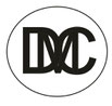
The students chose the colors because the logo leaves little room for manoeuvre due to its structure. Relatedly, colors should not distract from the shape of the logo. The logo was only designed in black and white.
This corporate design opened up the course of study to the inspiring idea to take our media away from poster design and thus brought us to further conclusions such as path systems, light settings, paper bags or games. In addition, we came to the conclusion to divide and reshape our logo.
The design of the flyer used the gaps of the Corperate design. The course of study used the shapes of the logo to insert recurring elements and thus to introduce the viewer to a recognizable value. The responsive design for digital media led the students to the idea of folding our flyer. Firstly - because of the origami idea and - secondly, to give the visitor more freedom of discovery. The potential visitor must first open the flyer in order to get more information.
The responsive design plays with the display in the smallest or largest place in order to appeal to the user - and on different devices. This is how we came up with the idea of building our flyer. The back of the flyer is an exact copy of the front. However, on the lower part of the flyer, care was taken to show the minimalist map, address and logo. When folding the flyer from DIN A4 on DIN A6, you can see the before mentioned logo on one side and the card on the other. You have to fold the flyer apart – a small homage to the inspiration of the Japanese origamis – to see the entire contents.
After the above-mentioned debate on the aesthetics of the poster, a very similar design of the flyer was agreed, with the difference that one distanced one another from the symmetry. Thus the basic idea of an "origami" developed as a design element. The changes in angles, pruning and reflection made it possible to create new interesting shapes, which are arranged with a mostly uniform distance between each other.
The front and back are pioneered by the large downward- triangular shape at the top left ("Eyecatcher"), in which the title can be found in the chosen typography ("Helvetica Neue – Ultra Light") . This downward-pointing form is intended to encourage reading/viewing (an arrow down as a signpost). The arrangement of the title and "Kaufmanns-And" in which "Eyecatcher" served, in contrast to the poster design, to highlight the working groups. It is not the title that is highlighted, but the prestige of the specific topic in detail. It is also possible to use the small details, such as the title of the workgroups, and highlighting a single letter with the color "red". This contributes to the fact that each working group has a letter in its small definition of its subject, which is composed with all of them together with the title. In addition, a coexistence is subconsciously created, which could otherwise only unite the otherwise very different themes of the exhibition under the title "Trophies & Collecting".
The back of the flyer is an exact copy of the front. However, on the lower part of the flyer, care was taken to show the minimalist map, address and logo, as on the poster. When folding the flyer from DIN A4 on DIN A6, you can see the aforementioned logo on one side and the card on the other. You have to fold the flyer apart – a small homage to the inspiration of the Japanese origamis – to see the entire contents.
Development of the poster
The objects from the logo design created a variable CD. The course now had the possibility to design various media on the basis of the same basic idea of the design, refers to a symmetrical arrangement. After a debate about the desired aesthetics of the poster, the most concise object to be placed in the middle as an accent. It was supposed to act as an eye-catcher, so it was colored red. The other objects were also arranged symmetrically to create white street-like surfaces in the space between them.
These freedoms were used to introduce additional keywords with the fonts already mentioned. These also refer to the individual working groups from the teaching project. In some cases, individual letters of the slogans were colored with the same red hue in order to ensure that the viewer approached a further examination of the individual themes. The title of the exhibition and the date were arranged in the larger black objects. The font is in white, creating a strong light-dark contrast. Accordingly, the title stands out. In support of the appearance of the image, a square-long red accent was added (&) to the central central accent.. At the bottom right of the poster is our exhibition logo. In the lower left corner there is a map of the exhibition site. The card was made to ensure that it corresponds to the purist noble design of the poster. According to this, it is minimalistically designed and forms an aesthetic connection to the white intermediate lines in poster design.
Implementation
After the conceptual work was completed, the students of the MKD 2.Sem course implemented the digital files as analogue print products on 12.06.2013. Of the flyer, the students printed a print run of 100 copies, of the poster 20. These were folded by students. The flyer originally corresponded to a Din A4 format (210x297 mm), which we then folded to a format of Din A6 (105x148 mm). When the folding process was completed, the students laid out the flyers in various locations, such as in the entrance area of the MHMK.We also distributed the posters and hung them up. In doing so, we made sure that they are easily visible and attract potential audiences.
Room separation design
With this design element, we were inspired by the purist spatial separation design. We used it accordingly for our conditions on a spatial scale. White thin partitions, which are used in the MKD 2nd and 4th semester Built from strong white cardboard panels and left hanging from the ceiling in collaboration with course leader to reduce the space for our relatively small exhibition.
reflection on the project
By designing the appearance for the exhibition, I got to know the individual work and production steps as well as how to make effective decisions and dividing work in a team. In addition, I have learned different creativity techniques that support idea development. A negative point in the cooperation was the effeciency, which brought only four lessons every two weeks. Here it would have been a clear advantage, if it is either weekly or concentrated in a short period of time, to let the course take place.