Student initiative
I ,Dominique Mireille Cimen, student of the study course Media and Communication Design would like to do redesign as a study initiative the Website of the Intercultural Centre for Girls and Young Women Scene Change,an institution of the District Office Neukölln of Berlin, . (http://www.szenenwechsel-berlin.de/site/ ( Status of 2015) ) This facility is open to girls and young women from different cultural backgrounds from 11 to 24 years and offers various offers such as: -Music Room -Dance Room -Creative Offers -Birthday Celebrations
I would like to redesign the website because I think the website of the institution helps to attract more girls and young women and to get investors, donors, partners etc. The aim is to create a positive first impression of the Intercultural Centre for Girls and Young Women, and thus also to encourage them to accept these offers. For this reason, I would like to try to optimize the website in a creative and development phase/concept (wireframes, flowchart, user journey, user stories, etc.).
Project developement phases
The creative and development phase is carried out in the following steps:
Phase 1: ANALYSIS for problem detection: -> What is special? (Creative Brief)
Then collect research and information:
heuristic evaluation of websites of other youth centers in Berlin
Phase 2: CONCEPT
for different solution variants -> Brainstorming
-> Moodboard
-> User Journey
-> Set the structure found in this way (Flowchart)
Phase 3: DRAFT for problem solving. -> Build models on scale (wireframes),
Phase 4: WORK out the design -> Work out details, then optimize the overall shape
Phase 5: Realization of the Project
- Realization of the website with the help of WordPress:
- Finding theme
- Adjusting theme according to concept Phase 6: Conclusion
I am in close contact with the centre to ensure that my ideas and designs meet their requirements and wishes. The centre will then decide whether this concept should be implemented.
Phase 1
CREATIVE BRIEF
Who? The product: What kind of product is it and how does it work? The product is the website and is used to present the center.
The brand: What does the brand stand for? The center stands for cooperation, helpfulness, support and working in a team.
The situation: What are the strengths and weaknesses of the product compared to the wide Competition?
Strengths: clear, easy to use, understandable
weaknesses: hardly designed, unappealing design, nothing innovative
The target group: Who to talk to are we? : Girls and young women from 9-24 years
investors, cooperation partners, etc.
What is the website supposed to do?: - To point out the target group's offers and convince them to participate in them
- investors, cooperation partners etc. should be convinced to work with the centre
- stand out from the rest of the youth centres in Neukölln
The core message: Which offer can we do it?: The core message is that girls' centre tries to support girls and young women in their desires, problems and interests and to be a platform where everyone can communicate openly and honestly with each other.
The reason: why can we say so?: We can claim this because we have competent staff and the facilities to get this message right.
How The Tonality: How shall we say this?: The tonality should be adapted to the different target groups. Tonality should be based on a neutral basis, so that there are no conflicts between the target groups.
The reaction: What thoughts and feelings do we want to trigger?: Visitors to the website should get a first impression of the work of the centre. They should be enthusiastic about the many offers and projects and thus also be convinced to accept these offers or that sponsors, cooperation partners etc. want to work with the center.
Research and information
In addition, I have carried out a heurical evaluation:
1.1 heuristic Evaluation: According to Balzert, a heuristic evaluation is understood as the systematic examination of a website according to predetermined criteria. It is an inspection method. According to Sarodnick, the goal of the heuristic evaluation is to find as many mistakes as possible with as little effort as possible. Balzert finds the following definition for implementation: "It is carried out by several usability experts, who examine the site individually and then merge its results. Research has shown that even a few evaluators are enough to detect many usability problems. An additional domain knowledge of the experts is recommended. Nielsen describes in 10 general heuristics.
1. Visibility of system status
2. Match between system and real world
3. User control and freedom
4. Consistency and standards avoid errors
5. Detecting before remembering
6. Flexibility and efficient use
7. Aesthetic and minimalistic design
8. Support in recognizing, Understand and edit errors
9. Help and documentation
http://kma-ev.de/index.php?id=5 (opened on the 10/20/2015)
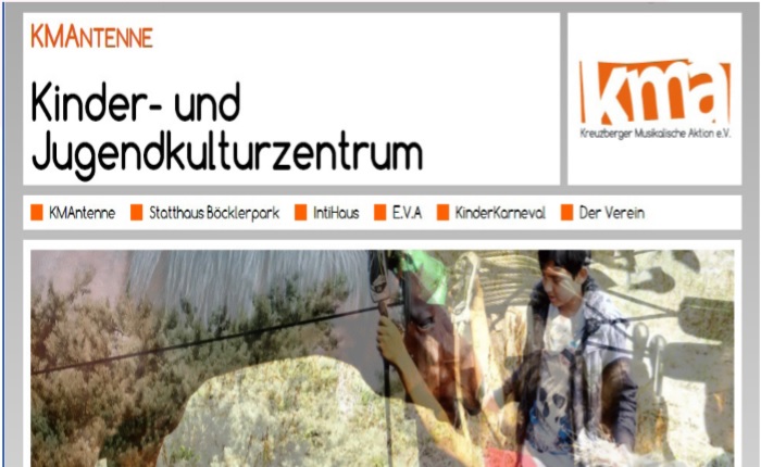
1. System status visibility : You can always see where you are on the website using the headings in Bold.
2. Match between system and the real world: There are no special terms that you don't know.
3. User control and freedom: :Any process can be canceled, if you click on the field with the logo of the association, you will click on the start page or simply on another menu field.
4. Consistency and standards: : terms to which a particular article refers are consistently the same. Likewise, the operation of the website is consistently the same. The articles are structured consistently with the same structure.
5. Avoid Errors: No errors have been made when using the website.
6. Recognising before remembering: The website eliminates the need for changing dialogs from the point of view of operation, since the structure of the is the same in all places. This is also implemented in the website.
7. Flexibility and efficient use: There is no long navigation. A function to organize and save links to articles does not exist.
8. Aesthetic and minimalist design: The website is well designed and is a good example of minimalist design. All elements are easily recognizable and appealing to different target groups.
9 . Detection support: , Understanding and editing errors Because there are no errors, there is no need to help you identify, understand, and edit errors.
http://www.nw80.de/ (opened on the 10/20/2015)
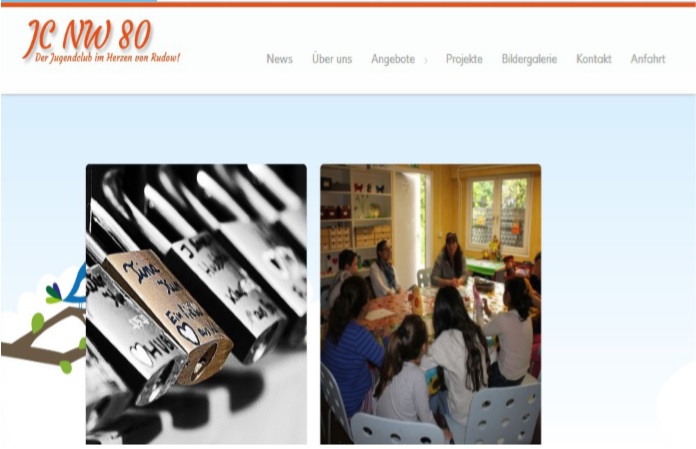
1. Visibility of system status : You always recognize where you are on the Website using the headings.
2. Match between system and the real world: There are no special terms that you don't know.
3. User control and freedom : Any process can be canceled, if you click on the field with the logo of the association, you will press the start page or simply on another menu field.
4. Consistency and standards: Terms to which a particular article refers are consistently the same. Likewise, the operation of the website is consistently the same. The articles are structured consistently with the same structure.
5. Avoid errors : No errors have been made when using the website.
6. Recognition before remembering :The website eliminates the need for changing dialogs from the point of view of operation, since the structure of the is the same in all places. This is also implemented in the website.
7. Flexibility and efficient use : There is no function to organize and save links to articles.
8. Aesthetic and minimalist design: The website is well designed for the target group but one should have used the space more or changed the grid. All elements are easily recognizable and appealing to different target groups.
9. Help detect, understand and edit errors : Since no errors can occur, there is no need to assist in detecting, understanding and editing errors.
Phase 2
I have discussed with some employees what functions the website should include: - the menu guide should be kept - clarity - easy use for users and the center - modern design - let the latest news
be displayed on the home page right away.
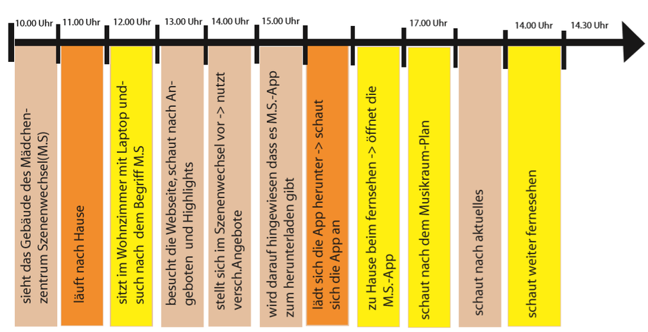
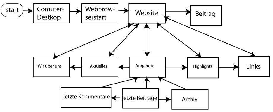
After the individual functions have been discussed, I have developed a User Journey and a Flowchart.
User Journey
flowchart
Moodboard
Then I created a Moodbard for the different website designs
I decided to skip Phase 3 and develop three design concepts so that the center can choose one of them so that I can develop it further and then create wireframes.
I have developed three design suggestions from which the managers of the Girls' Center choose scene change and get feedback..
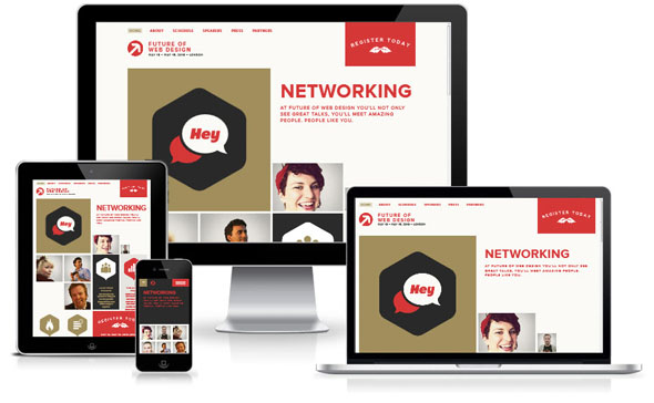
Design Proposal 1 , 2, 3
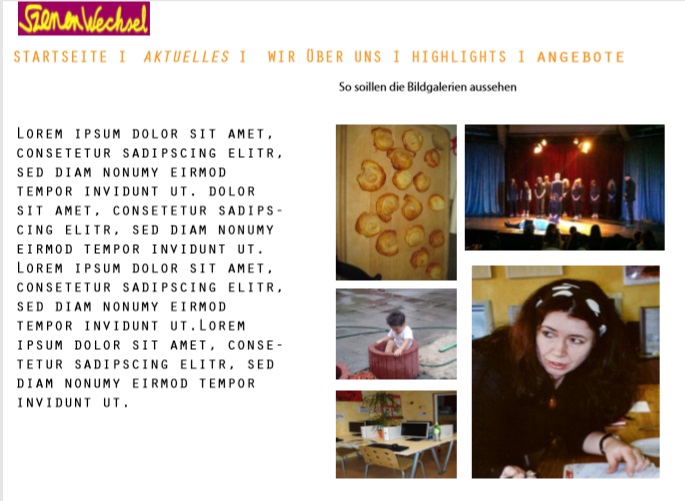
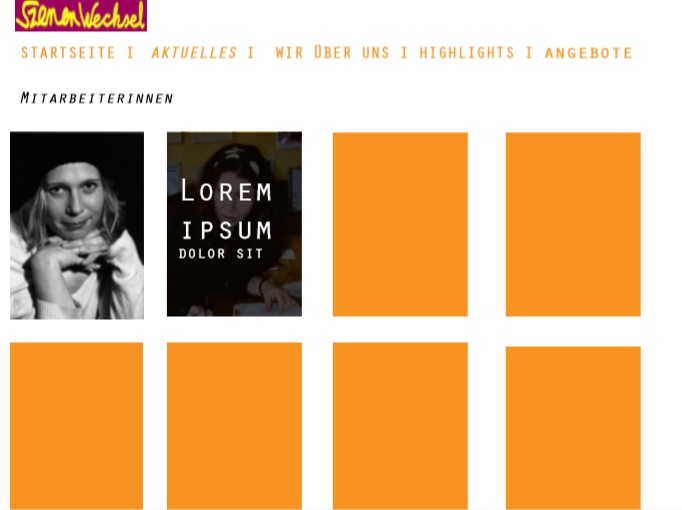
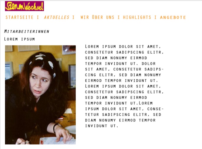
With all my design proposals i developed certain pages of the website which can give an overall vibe for the website By offering different proposals thereis a possibility to mix cetain structures, functions and colors
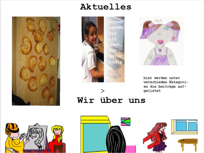
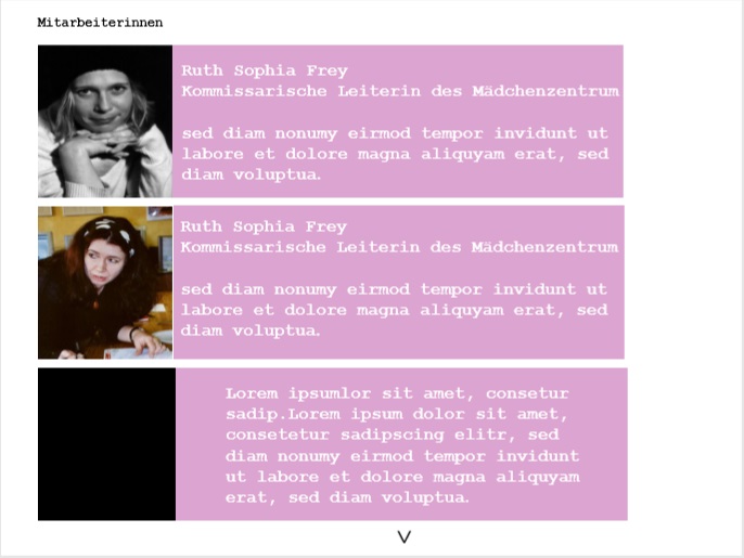
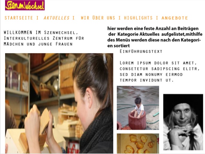
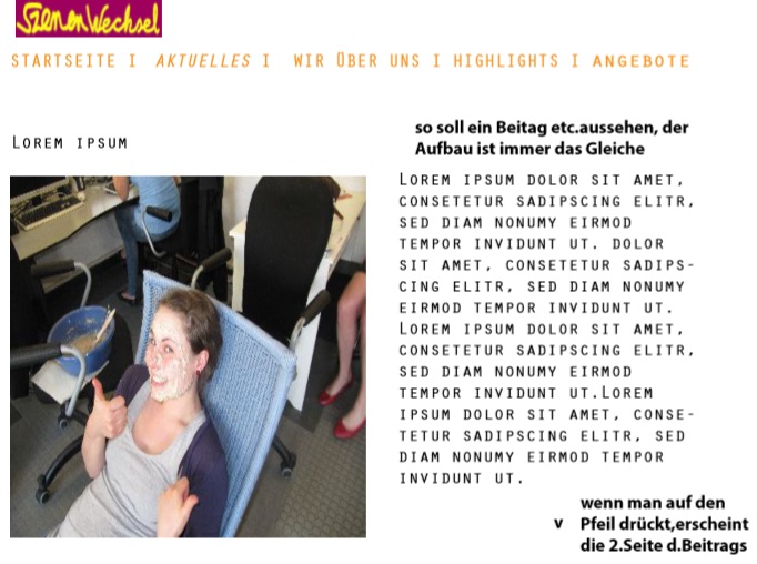
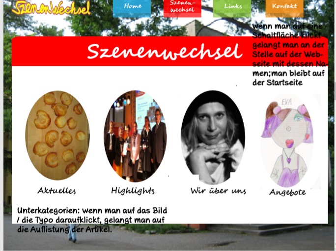
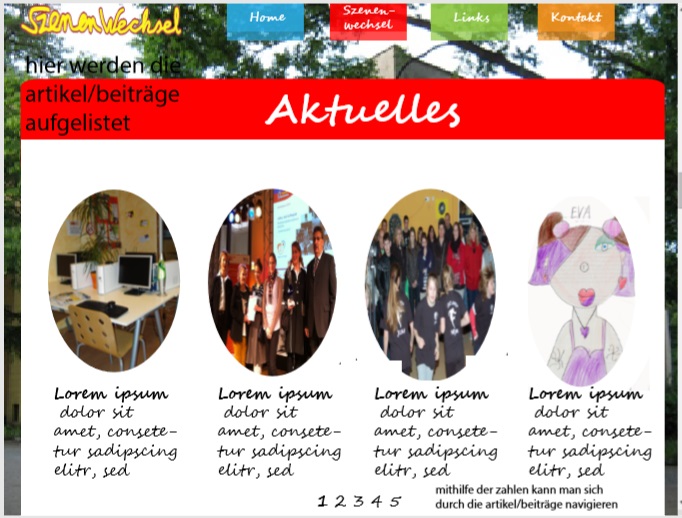
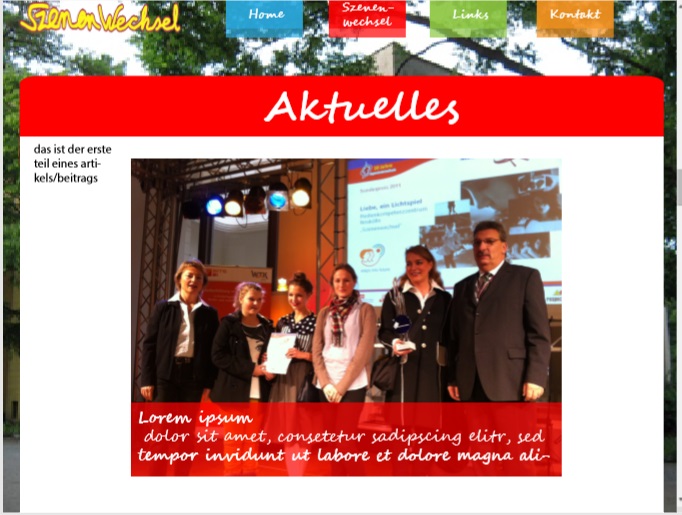
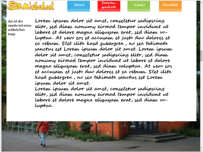
This design was inspired by the third moodboard.The Colors i used were inspred by the drawing the Kids created with paint. I decided to use pastel Colors so the different do not clash and irritate the Viewer. I wanted to create an Impression of imperefect perfection through Color,typo, unstructured/balanced spaces between photos and text.
The Feedback i got was it is an interesting and appealing design and has easy-to-remember process/functionality.
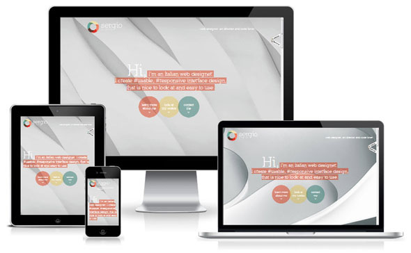
Design Proposal 2
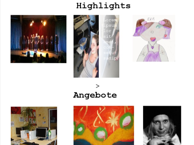
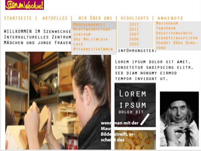
With this design proposal I wanted to create or more abstract and futuristic approach to the Website. I wanted to really use a different kind of approach in desining a website for the social sector, especially in the areas of children and young adults.Often times they are very colorful so the visitor get a fast message that the organisation works with children. My approach was that the website looks sophisticated and that it can be used for any organisation regardless the area they are working with. It is designed for adolescents and adults and should attract potential cooperate partners.I think it has a differentiating effect to similar organisations in that area.
I chose an orange related color palete because if you mix the two colors of the Logo you get an orange loke color. Moreover is orange kind of an agressive color and with the more clean,abstact and futristic font builds kind of an contrast,which relates to a more harmised feeling of the website. Using a light version of the background helps to prevent a disharmony of pictures/photos and the backround. Using primary colors as the background is often to aggressive for the visitors eyes so using a light or pastel version can be used.
Feedback on Design 2 (selected design): - best design of the three presented design suggestions - all functions are retained - many pictures are good - through the contributions to the start page there is always topicality - very clear - easily remembering process The centre gave me a lot of leeway in the creation of the website and also gave me the opportunity to improve and change the design concept.
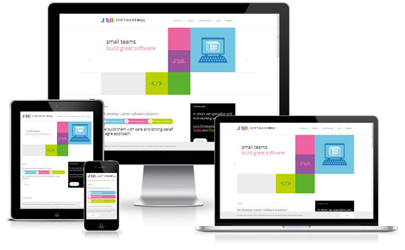
Design proposal 3
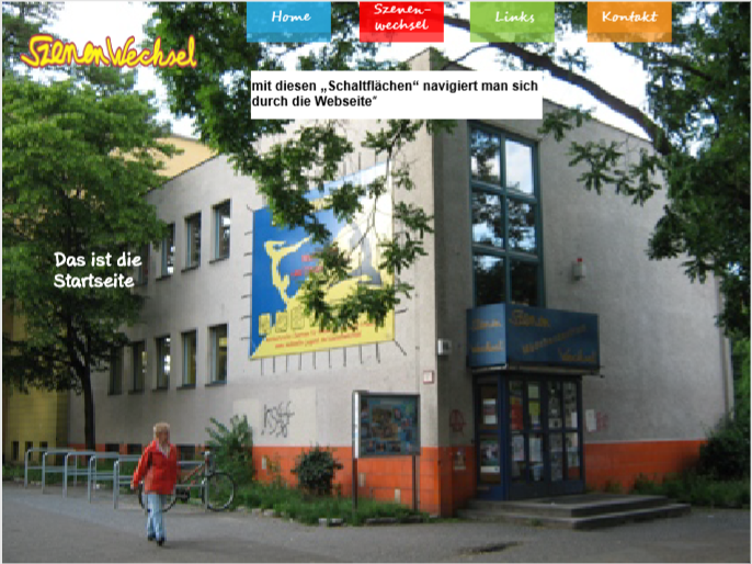
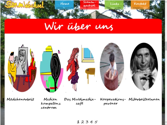
With this design i wanted every wrong design principals, strong (primary) colors, Using photps as a background, using ovals, using a typography that reminded the old fashioned softwares which wanted to offer more creative typography.
For me combining every wrong design or athetic principal represents a kind of rebellion and questioning why these principals were deemed as ugly or anasthetic- and rebellion and questioning is the principal keywords for children,tennagers and young adults.
This design looks something children, teenagers or young adults would creste with the first experienes on designing a website.Instinctively the website gives the impression- everyone is welcome and there is no right or wrong - complete freedom of experencing and developing owns desires, hobbies and style.
For me combining all wrong design principals creates a harmony in the concept of itself.
Feedback on Design 3: - interesting design - appealing design - easy-to-remember process
Wireframes
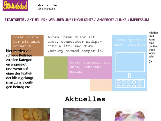
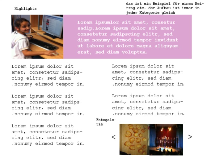
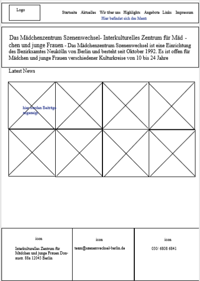
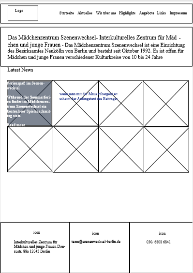
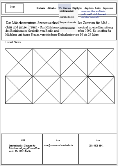
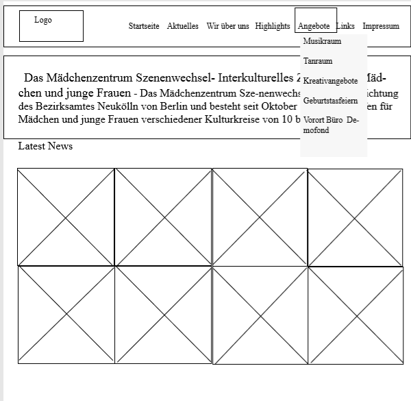
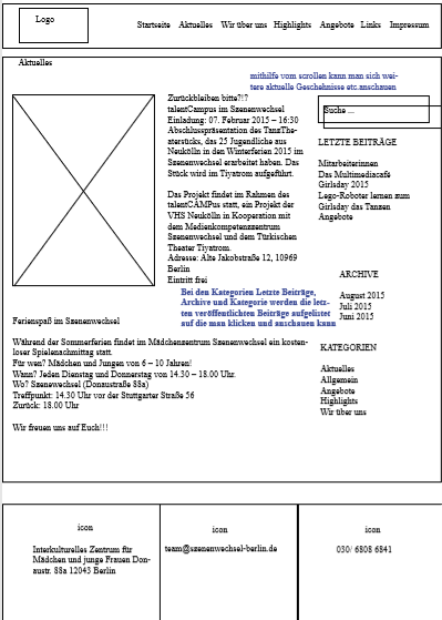
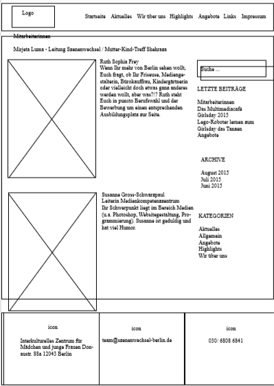
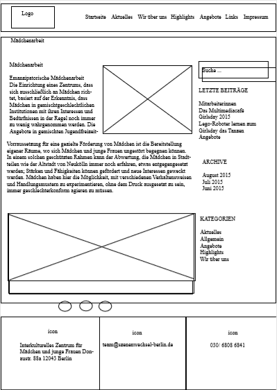
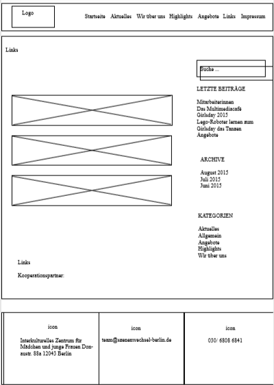
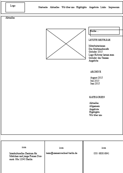
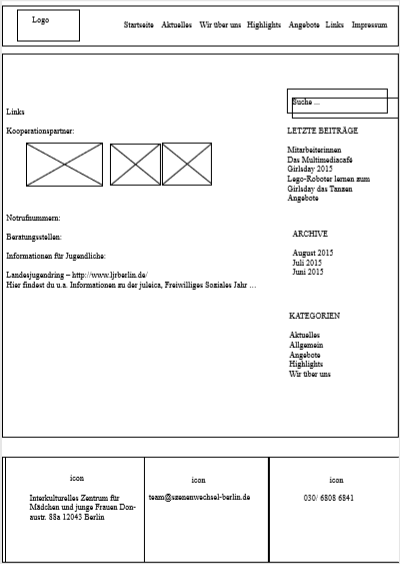
Then I developed wireframes for the second design.
Programming the website
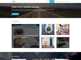
At the beginning I had to find a suitable theme for the creation of the website. I chose the Zifer Child theme because it resembles my design concept in design and functions.
First, I used the customizable to add the scene change logo, change background color, facebook link of scene change, email address, phone number, address, and Big Title Section. In addition, I have set the setting for the background as well as the home page to the last posts of the home page.

Then I created the individual pages and these are automatically added to the menu by my setting. I kept the menu setting because they were a good fit for the design and I didn't have to change it anymore.


When I created or programmed, I made my own design change. I have put the posts together in series and used the Big Title Section of existing theme. I also kept the footer. In addition, I have used two different fonts for the home page and the individual pages/posts, as well as the different background colors for the home page as a distinction feature. The font type for the comments, categories (archive, etc.) and menu always remain the same. When posting, I had to make sure that the pictures didn't fall below a certain size because the posts then shift and no longer appear in rows


Conclusion
By developing the concept of the website as well as creating/programming, I was able to develop my knowledge of WordPress and apply the learned design process for web pages. Through the participation of the Girls' Centre Scene Change, I learned to work with a social institution, which is important and what differs from companies. The scope given to me by the Girls' Centre to develop and change my design ideas and concepts helped me to develop different design concepts with the help of design research.
Strengths of the project result
The strengths of the project result is that it includes all the desired functions that the girls' center wanted to change scene. In addition, the website of function, concept and design is more modern than the old web page. The website is clearly arranged and limited to the necessary functions. The website consists of pictures and only a little text, which once again underlines the clarity and gives the visitor a good first impression for the furnishing.
Weaknesses of the project result
The Web page is missing the ability to display videos on the home page when the posts are displayed. In addition, in some places, in my opinion, there is too much text that could be shortened, which the change of scene does not want. The website also lacks an eye-catcher, which distinguishes the website from other websites from other social institutions.
Unfortunately, in the course of the project another person was commissioned to create a new website

